this is a page for
Category: Home Decor
Welcome to our Modern Farmhouse Bathroom Remodel on a Budget. Yes, we are remodeling ANOTHER bathroom (Check out our Master Bathroom Remodel Here) which is why sticking to a budget was super important. I can’t wait to share with you the breakdown of costs and all the DIY projects along the way.
*This post contains affiliate links. That means that if you make a purchase after clicking on a link, I may earn a small commission at no extra cost to you.
If you’ve been following along for any length of time, you know that we renovated almost every room in our home. What you may not know is that while that process was underway, we (Me, Chad, the kids and the dogs) were living in a 900 sqft apartment that’s attached to a workshop on our property. LOTS OF BONDING TIME! It was definitely not one of my favorite seasons. This was partly due to the fact that the apartment grossed me right out! It was completely unfinished and the bathroom was the cringiest room of all.
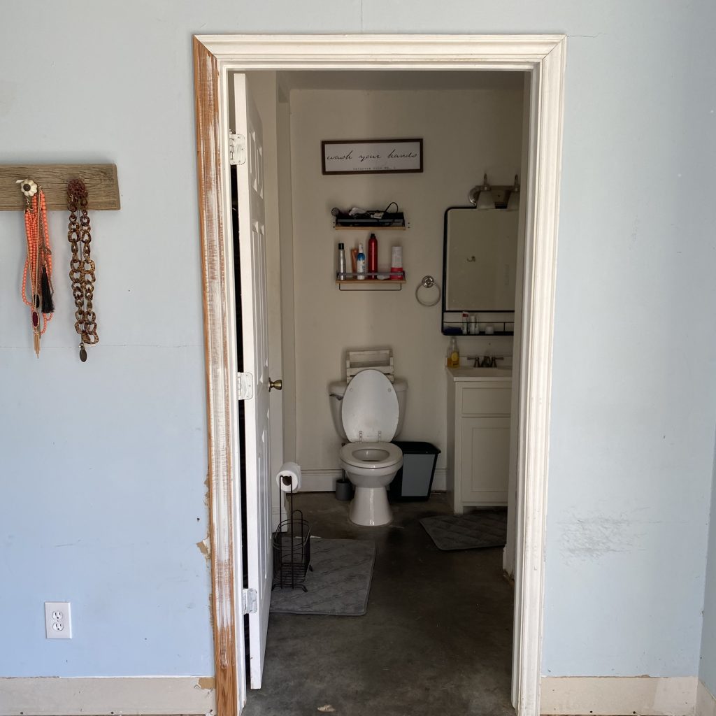
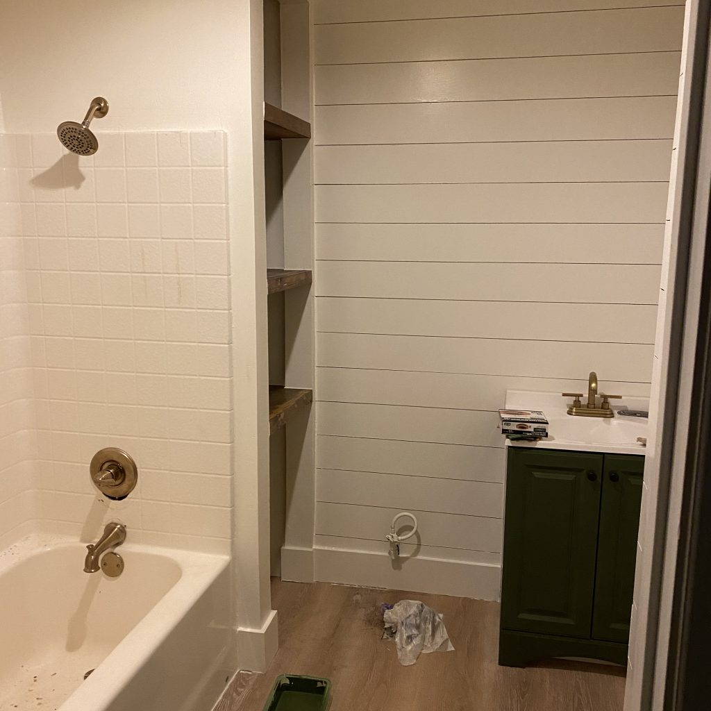
Before: Not Yet the Modern Farmhouse Bathroom We Envision
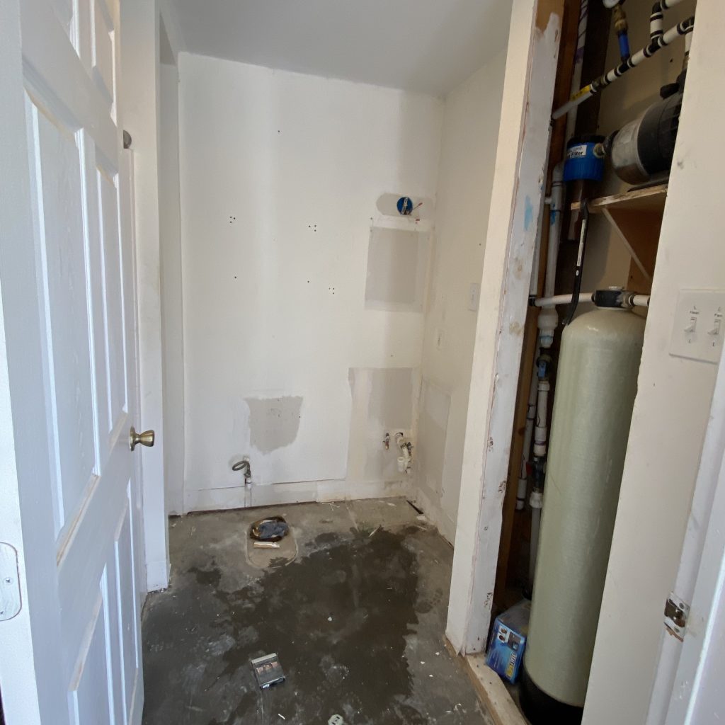
We’ve been in our house now for almost 3 years and we finally feel like we can make the shop apartment a priority so we started with the bathroom. There was a hole in the concrete floor that led under the shop where all the creepy crawlies live. A hole was left uncovered in the wall for easier access to the water. There wasn’t a door for the water pump which is super loud when it turns on. This was also a welcoming entrance to giant spiders, scorpions and mice! Oh my! Needless to say, it was due for a remodel!


The Walls & Paint
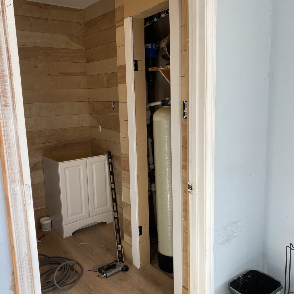
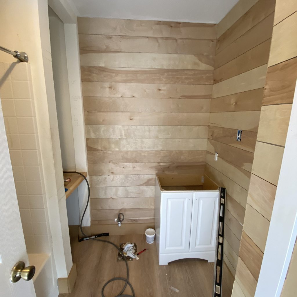
The first thing we did was “shiplap” the walls. Just like in our master bathroom remodel, we used floor underlayment cut into 6” strips. This gives the same beautiful shiplap look at a much lower cost.
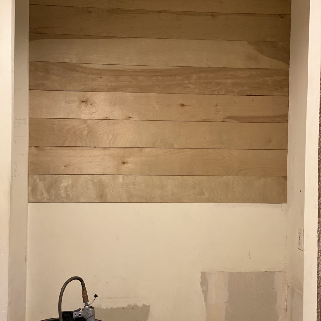
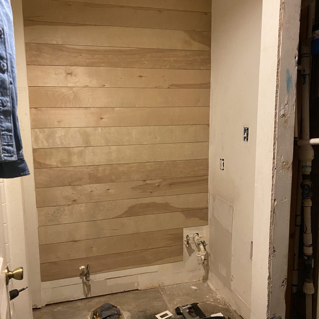
We cut the strips ourselves using our Ryobi table saw. HomeDepot will also cut them for you if you don’t have access to a saw. Once they were all measured and cut, we used a metal ruler as spacing in between each board. We left the area above the shower because we didn’t want the boards to warp because of the moisture. Eventually, we will build a walk in shower there but it wasn’t in the budget this time.
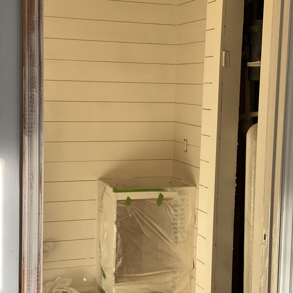
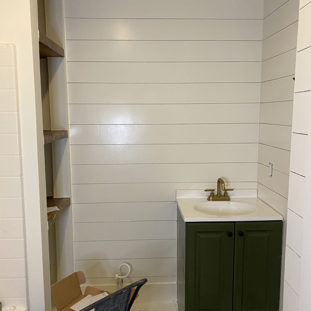
Once all the shiplap was up, I finally got to try out my paint sprayer! UH-MAZING! Chad got it for me as a Christmas present and I was dying to find a project to use it on. DIY tools are the way to my heart. We painted the walls using an oil based paint in a semi-gloss finish in the SW color, Alabaster. We used oil based paint because it hardens as it cures and doesn’t chip and scratch easily. This is something we learned from our home remodel.
The Shelves
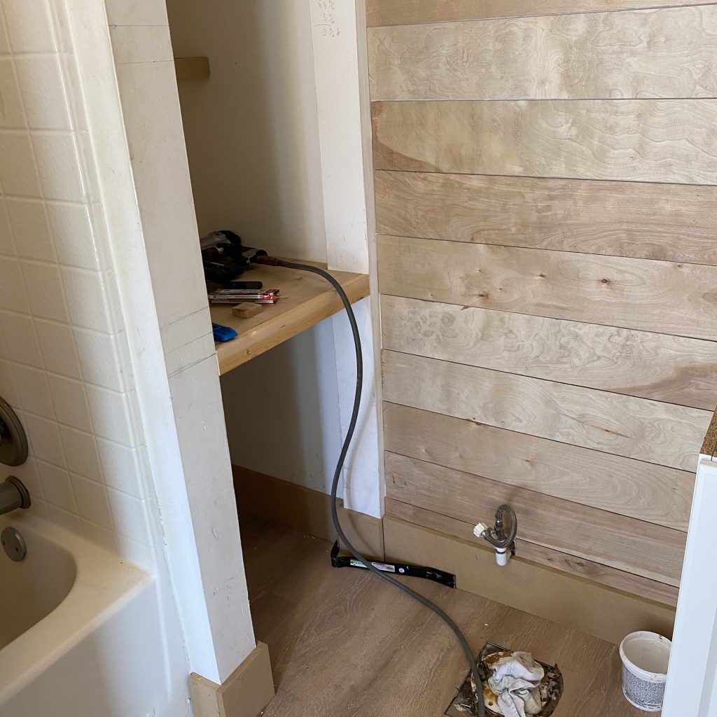
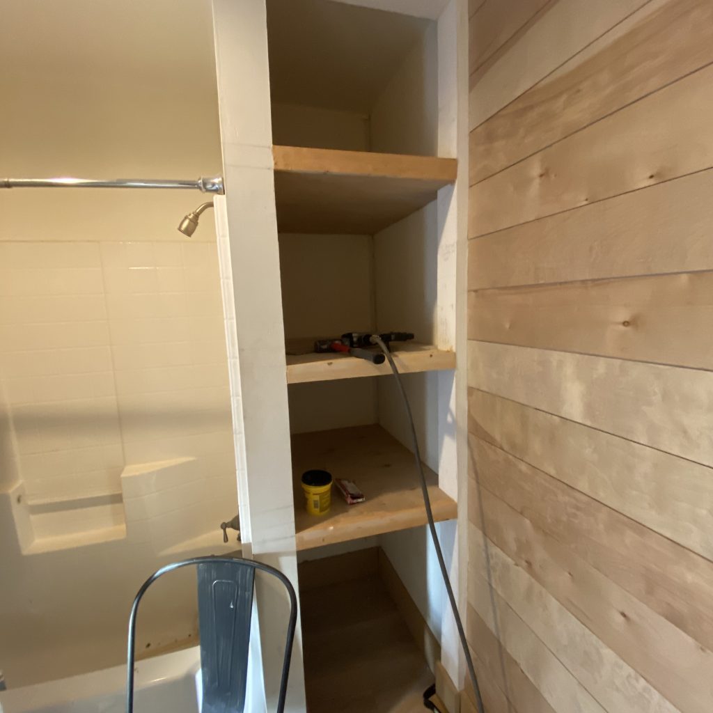
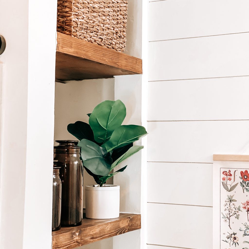
The next thing we did was add some built-in shelves to this weird corner nook. This added style and functionality to this little space. We framed out the shelves using MDF and covered the top and bottom with more underlayment to give it a wood veneer. Next, we nailed a 1×2 pine board on the front and then stained them all with Gunstock stain by Varathane. Lastly I sprayed the shelves with two coats of clear glossy polyurethane. This gave them a smooth glossy finish that would be easier to wipe down and clean.
The Floors
This was probably the easiest part of the entire remodel! First we had to fill the creepy crawly hole. We just mixed some concrete and filled it. Then we smoothed it over with a trowel. I picked out these Lifeproof luxury vinyl planks from HomeDepot. The installation was quick and easy. We didn’t need any power tools because we were able to cut it all with a utility knife. No glue, no mess and no stress! Yay! They look amazing and, as the name suggests, they are super durable.
Cabinets & Doors
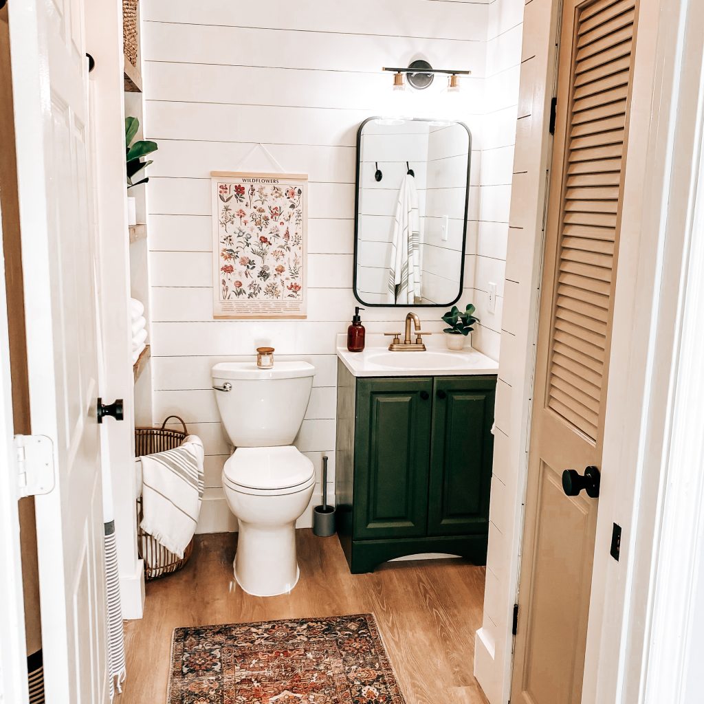
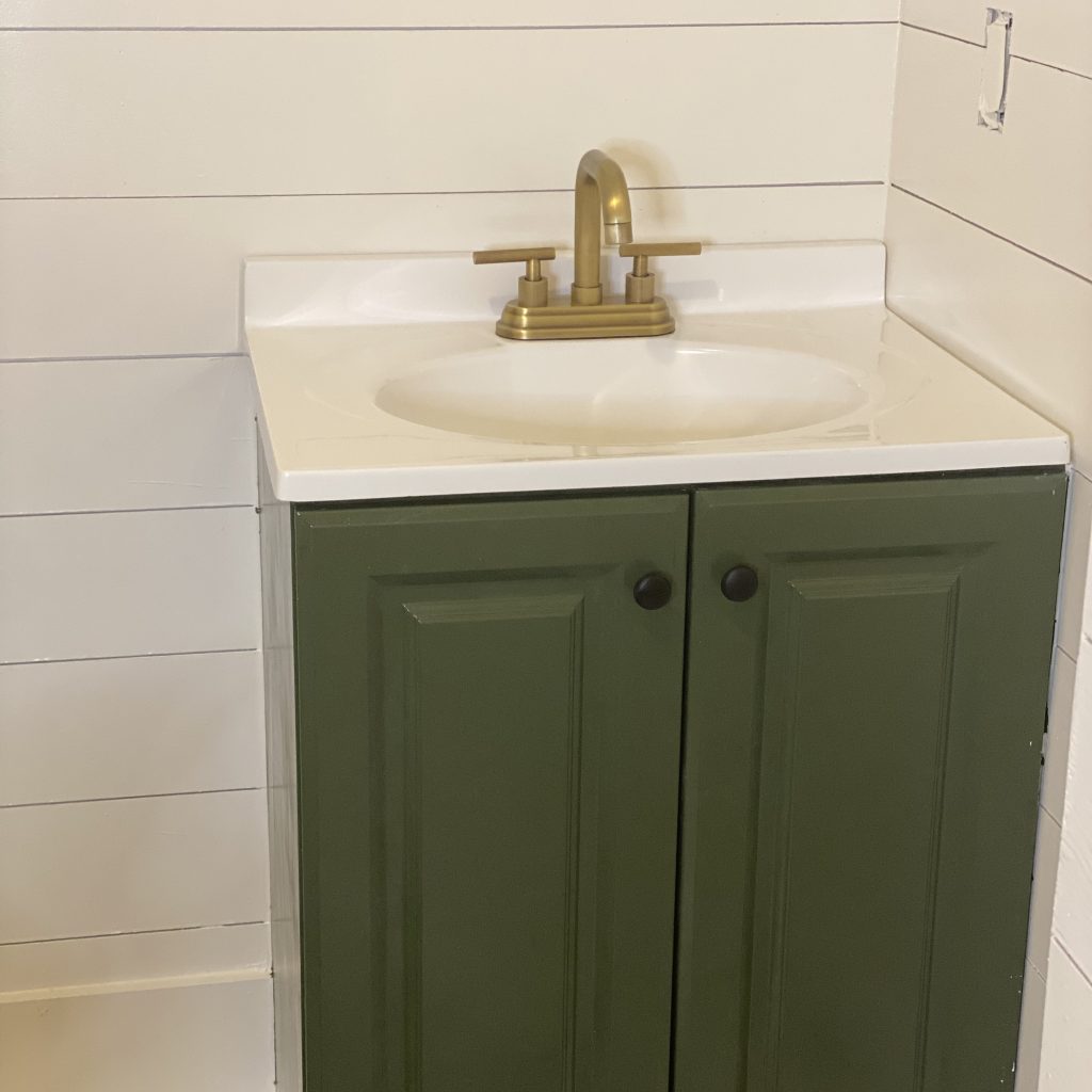
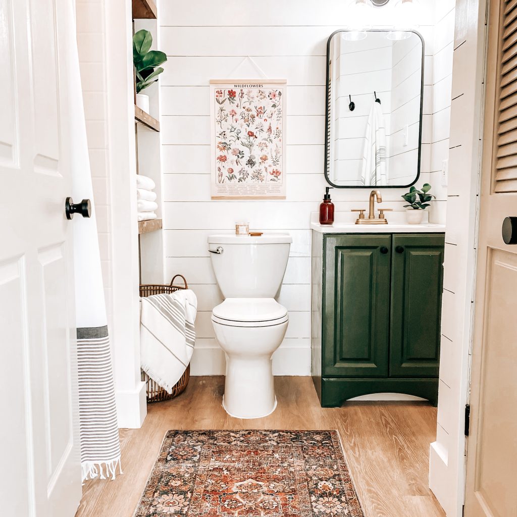
Geez-Louise! We realized real quick that you could spend days and all your money finding the perfect cabinets and doors. Since the goal was to try and NOT spend all our money, we had to get a little creative. We decided on a very basic vanity cabinet and painted it to make it look a little more luxurious without the cost of luxury. The color I used for this was Fresh Basil and I just rolled it on. In case you haven’t noticed, I’m really into greens right now 💚😍 I also spray painted the cabinet knobs matte black to match some of the other hardware.
I found an unfinished wood door online. It was a little smaller than the existing opening in the wall. Luckily, I found the door before we started putting up the shiplap because we did have to frame it out. After we got it all framed, I painted it and installed it. I LOVE IT! It muffles the sound of the pump and it keeps all the unwanted little pests out! I also love how this color gives a neutral and cozy vibe to our little modern farmhouse bathroom.
Lighting & Hardware
When we were shopping for lighting and hardware in our home, we shopped at so many different places. Some of it came from hardware stores, some came from specialty lighting stores and some came from various websites online. What we learned through all of that was Amazon had very similar fixtures to most of our favorites for less $$$. This was definitely the case for our modern farmhouse bathroom remodel too.
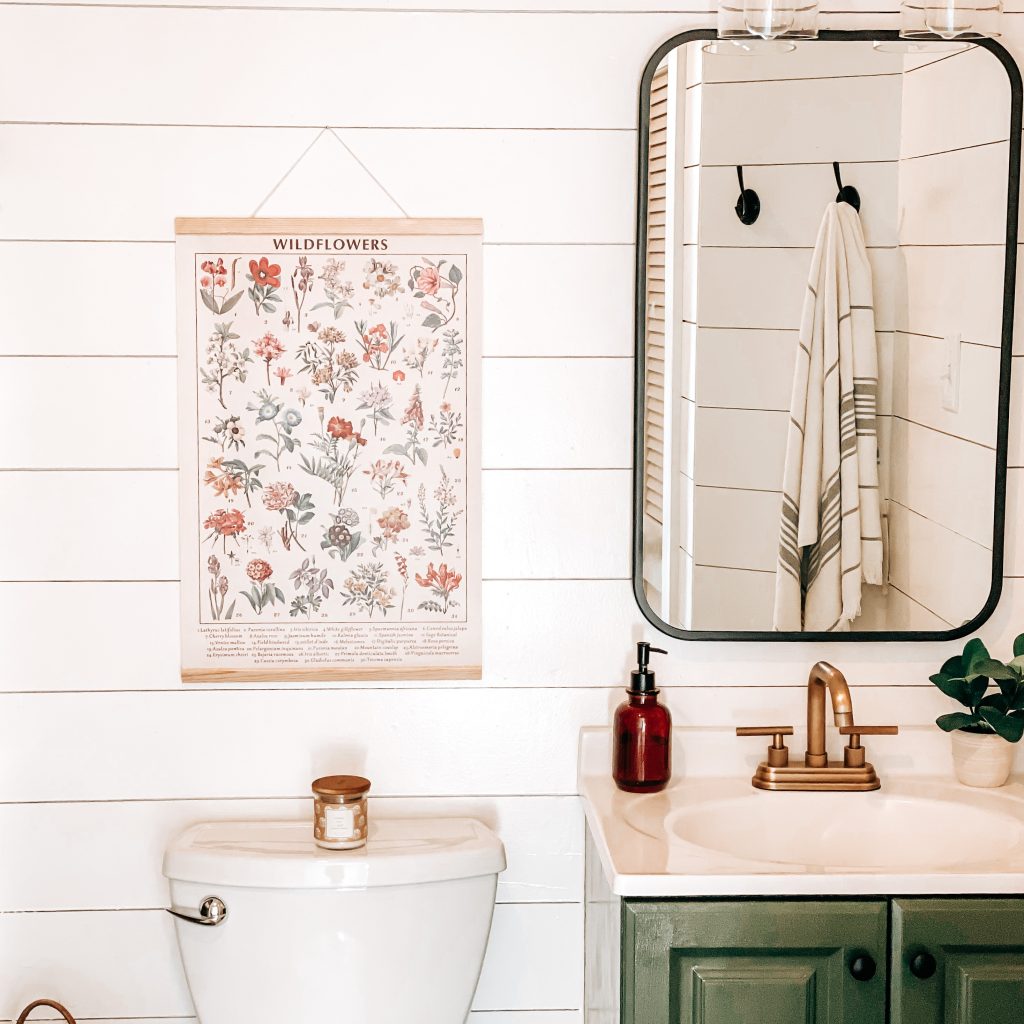
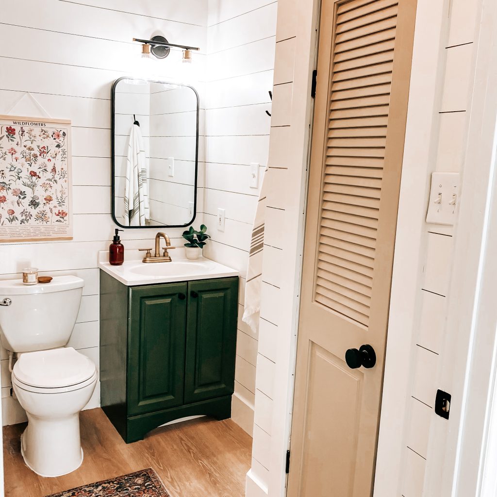
I love matte black fixtures and I also love the look of champagne bronze so I used both. The sink and shower faucets are champagne bronze. The door knobs, cabinet pulls, mirror and wall hooks are all matte black. The vanity light above the sink is a combination of both. I don’t know the rules for mixing and matching finishes so I just did whatever moved me in that moment. If there is some professional designer reading this and dying inside, I sincerely apologize. I’m not sure I would change it even if I did know the rules because I’m so happy with how it all looks.
Bathroom Decor
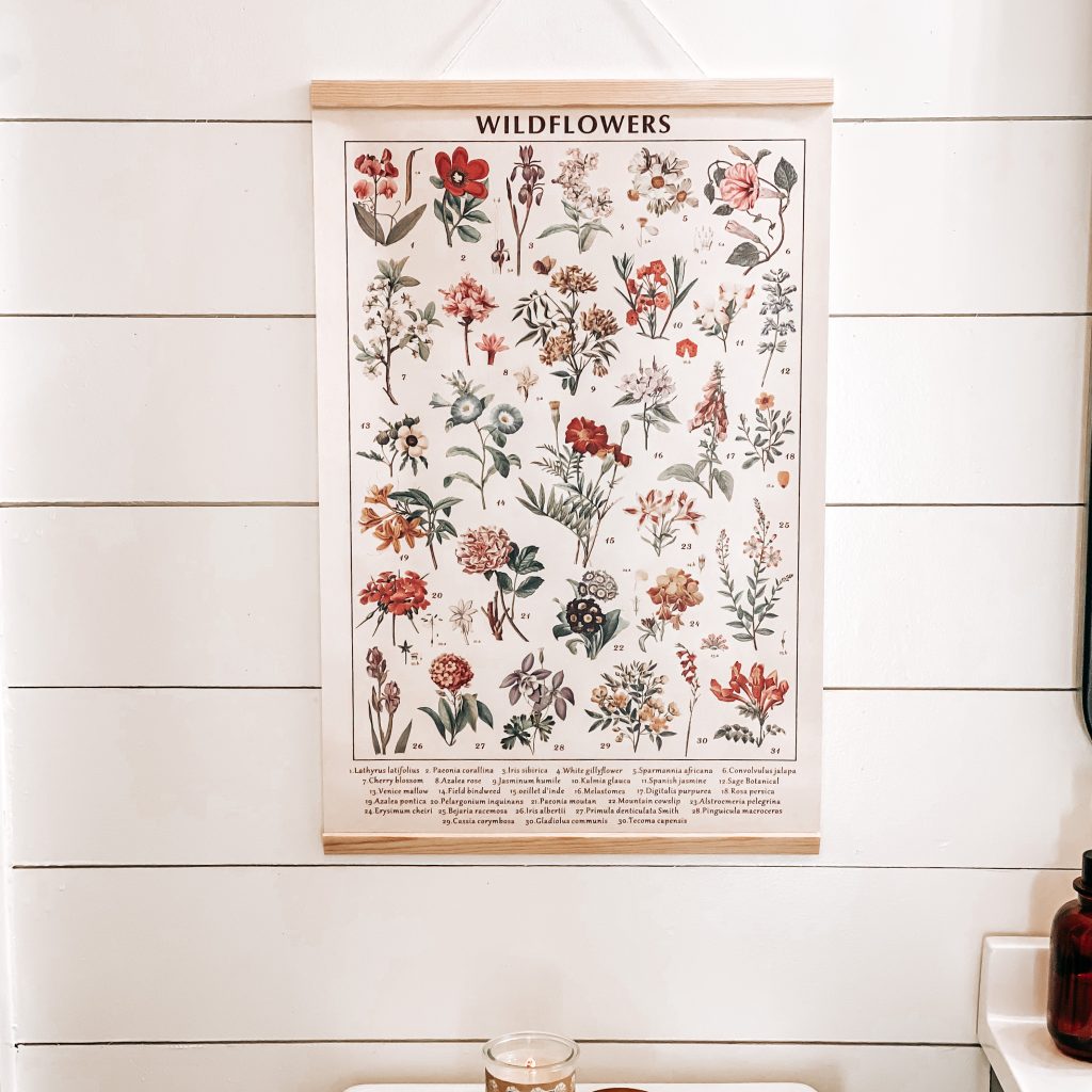
When decorating on a budget, it’s always smart to start by shopping your own home. I’m always surprised at some of the decor that I’ve forgotten about or just works better in a different space. Plus, it’s FREE! The only things I did “splurge” and buy was this adorable wildflower wall hanging, the runner rug and the wicker laundry basket that I specifically measured to fit under the shelves. I already had a simple shower curtain and rod so it wasn’t necessary for me to buy a new one. Buuuuuuut I came across one and couldn’t resist so to be fair, I’m including it in my cost 😉
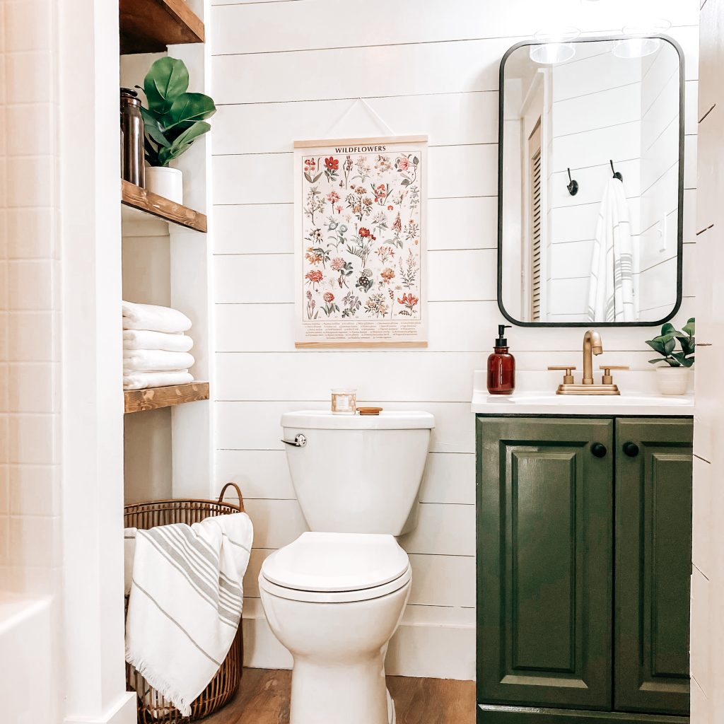
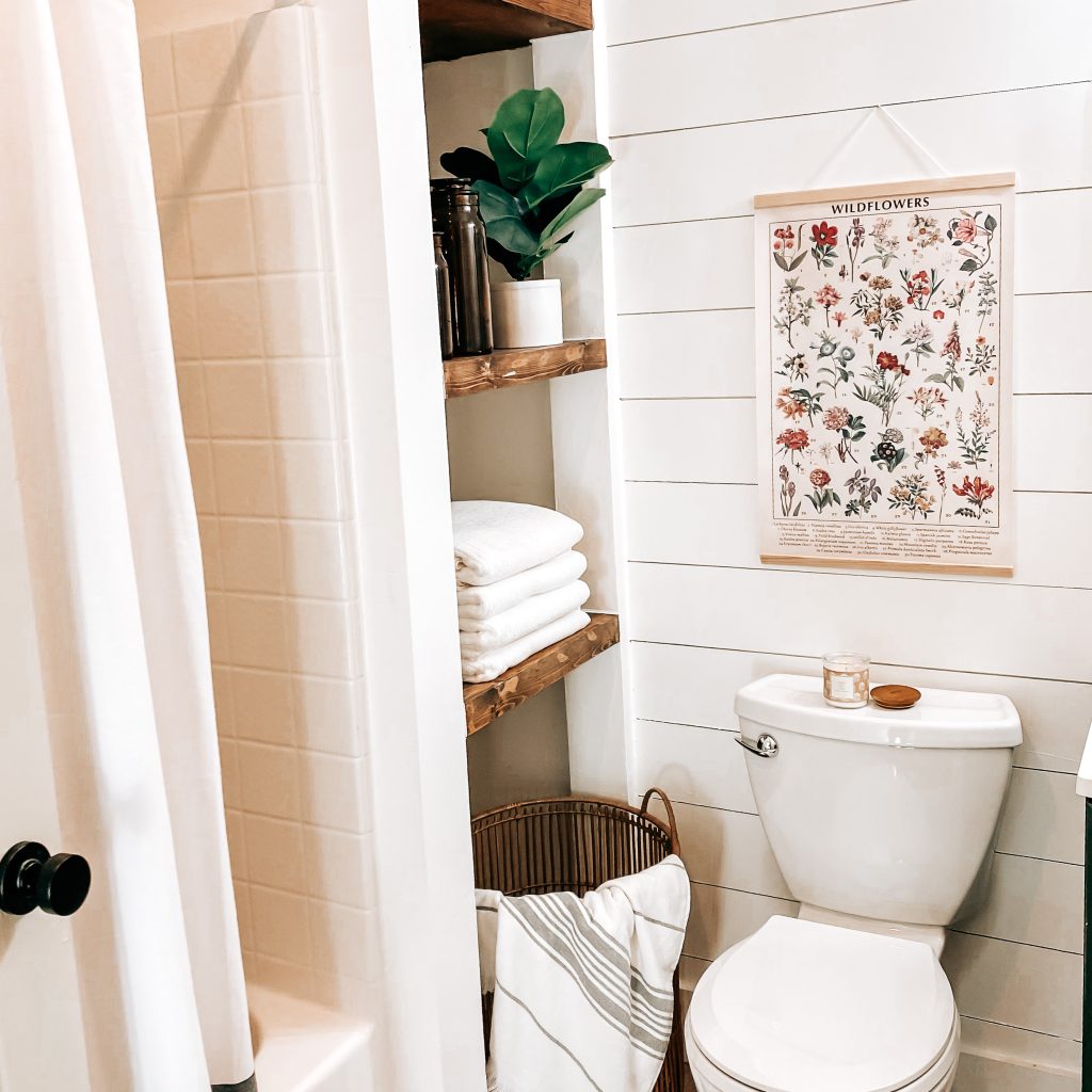
After: Our Critter Free Modern Farmhouse Bathroom
And that’s it! That’s our bathroom remodel on a budget! Our total cost was $993. Not bad! I’m so happy with the way it turned out. I’m also thrilled to not lovingly refer to it as cringy anymore!
What do you think? What cringy space are you looking forward to remodeling? Leave me a comment below and don’t forget to subscribe. You can also follow us on Facebook, Instagram and Pinterest to keep up with our day to day. Thanks for stopping by!
Product Links for Our Modern Farmhouse Bathroom Remodel
Boho Shower Curtain | Shower Curtain Rod | Striped Towels | Laundry Basket | Hyacinth Storage Basket | Amber Canisters | Amber Soap Dispenser | Fiddle Leaf Plant | Small Eucalyptus Plant | Fresh Citrus Scented Candle | Vintage Wildflower Wall Hanging | Runner Rug | Wall Hooks | Two Light Vanity Light | Vanity Cabinet | Sink Faucet | Shower & Tub Faucet | Black Vanity Mirror | Matte Black Door Knob | Unfinished Louvered Closet Door | Table Saw | Paint Sprayer |
Welcome to our Magical Harry Potter Themed Bedroom. This is definitely not one of my typical posts but it combines two of my very favorite things…Home Decor & Harry Potter! I am a HUGE Potterhead nerd so when Luke said he wanted a Harry Potter themed bedroom, my brain exploded with all the ideas.
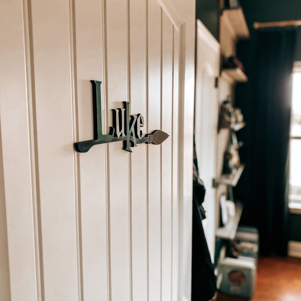
But how do you bring a wizarding world to life here in the muggle world? I am so excited to share how we transformed Luke’s room into a magical, wizard-worthy chamber!
⚡ Revelio ⚡

*This post contains affiliate links. That means that if you make a purchase after clicking on a link, I may earn a small commission at no extra cost to you.
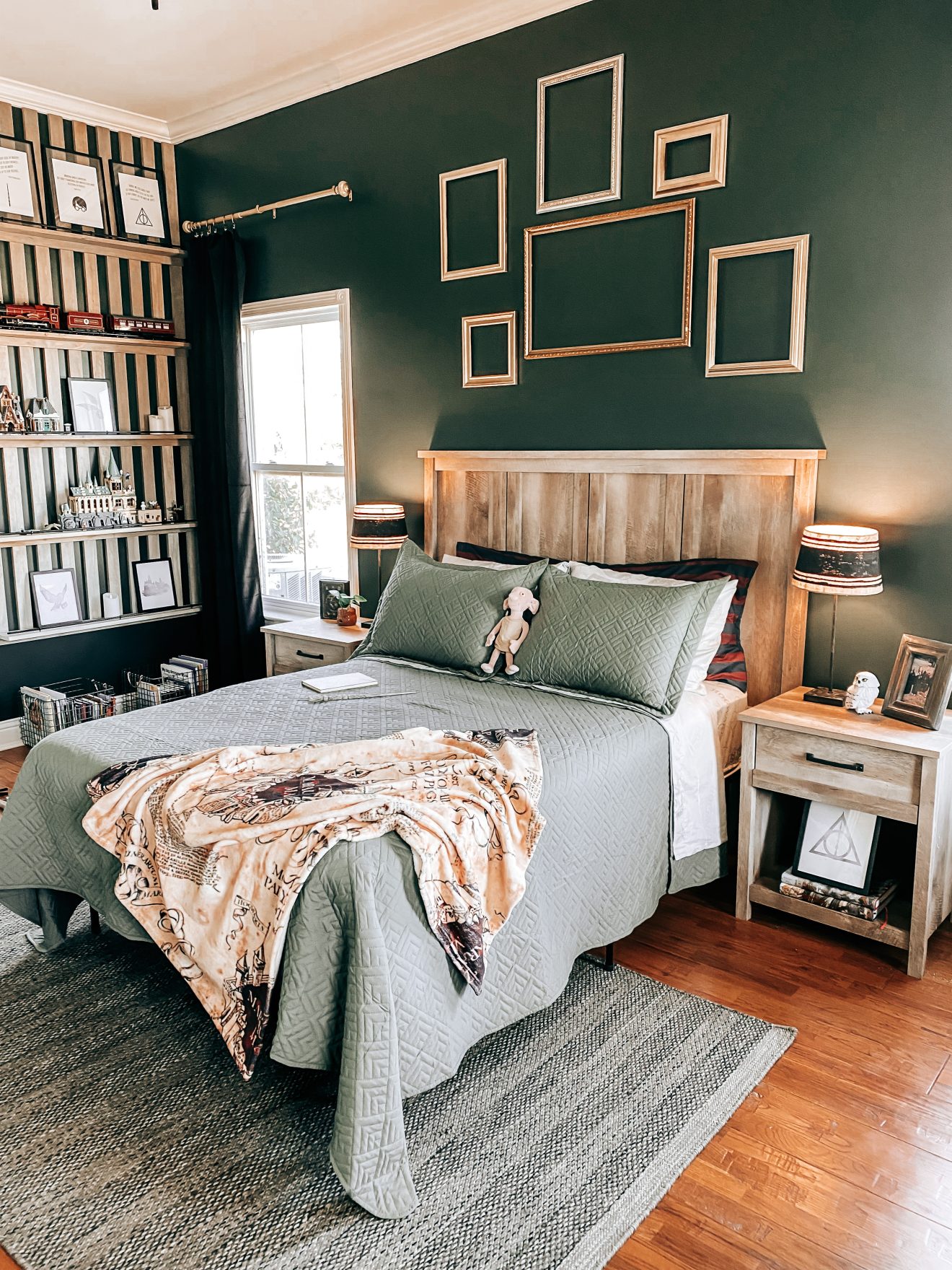
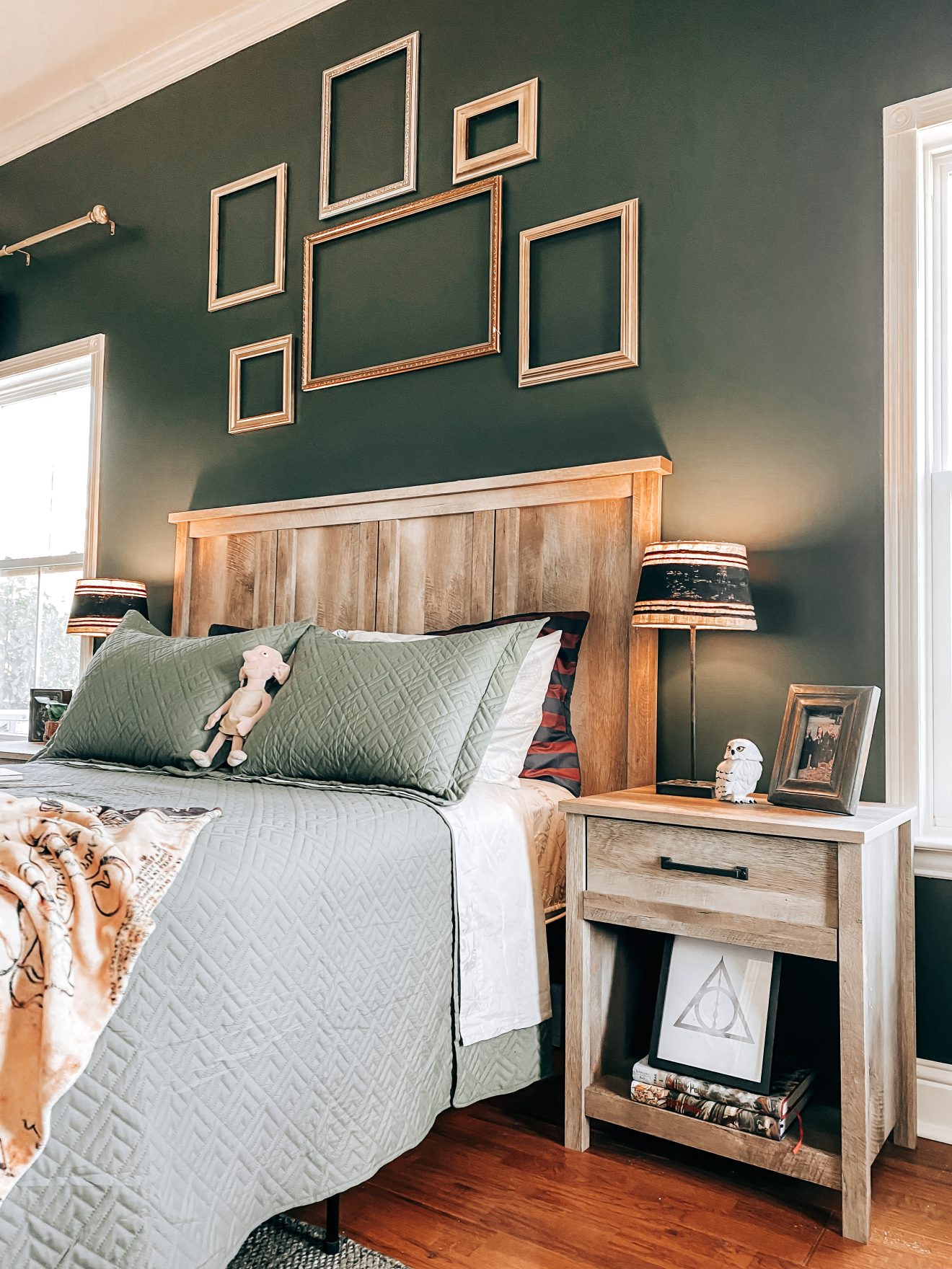
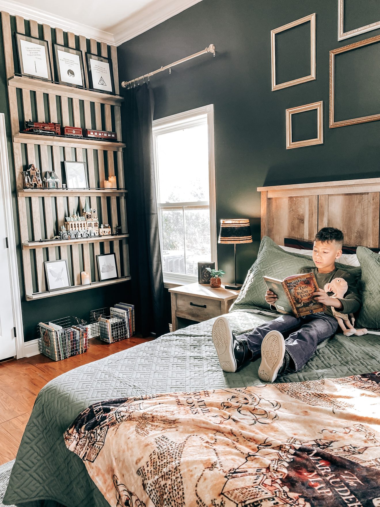
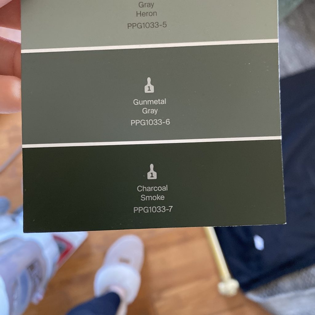
The first thing we did to start creating a Harry Potter themed room was paint. We don’t live in a dark stone castle but we can still create the moody vibes of a Hogwarts common room. Since Luke is a Slytherin, painting his room green was an easy choice. Charcoal Smoke is the perfect moody green.
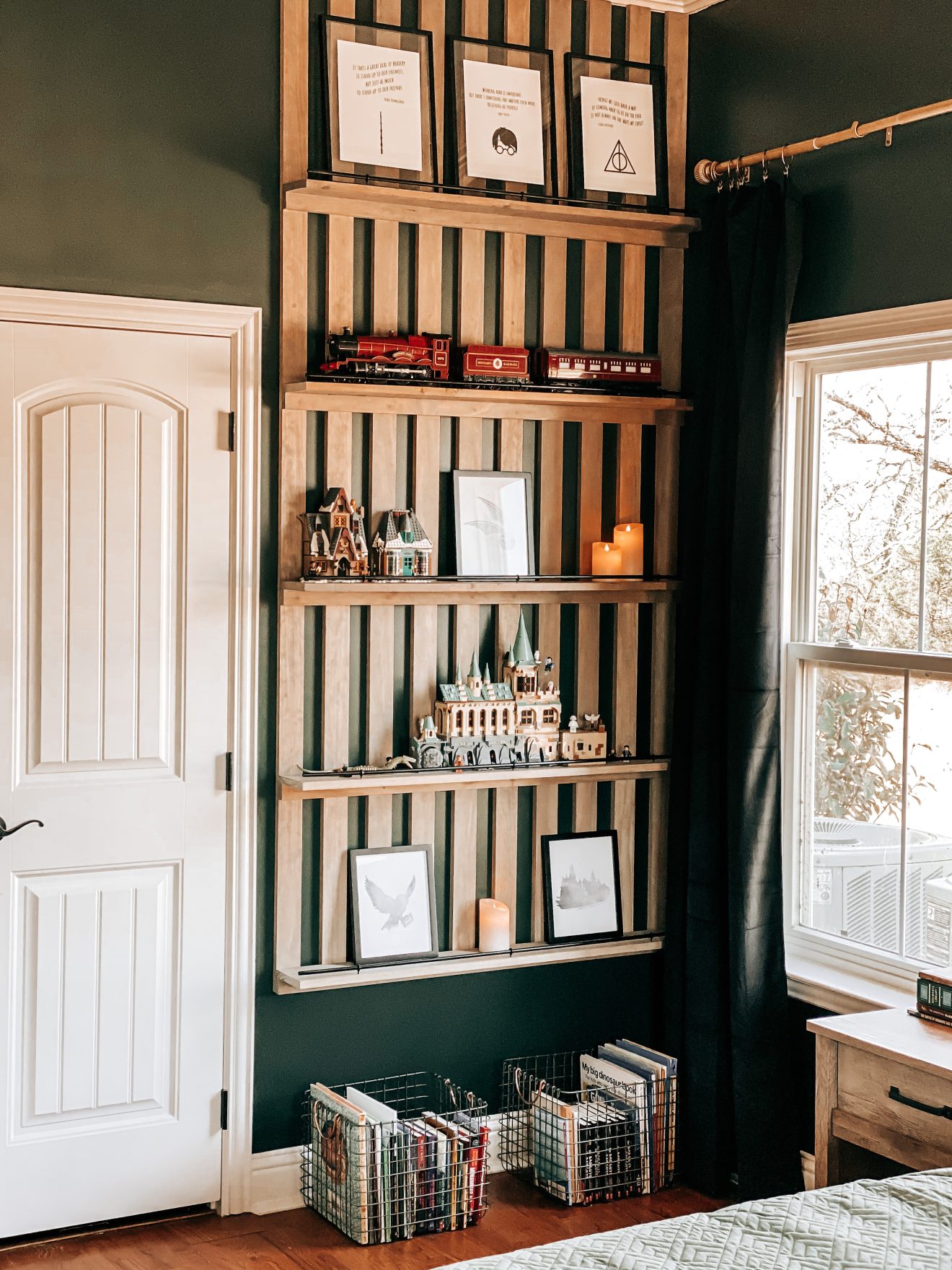
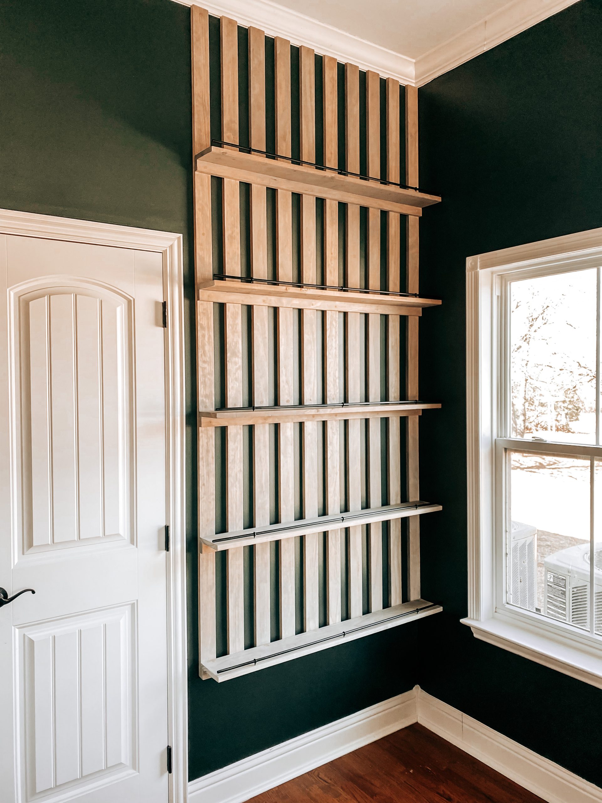
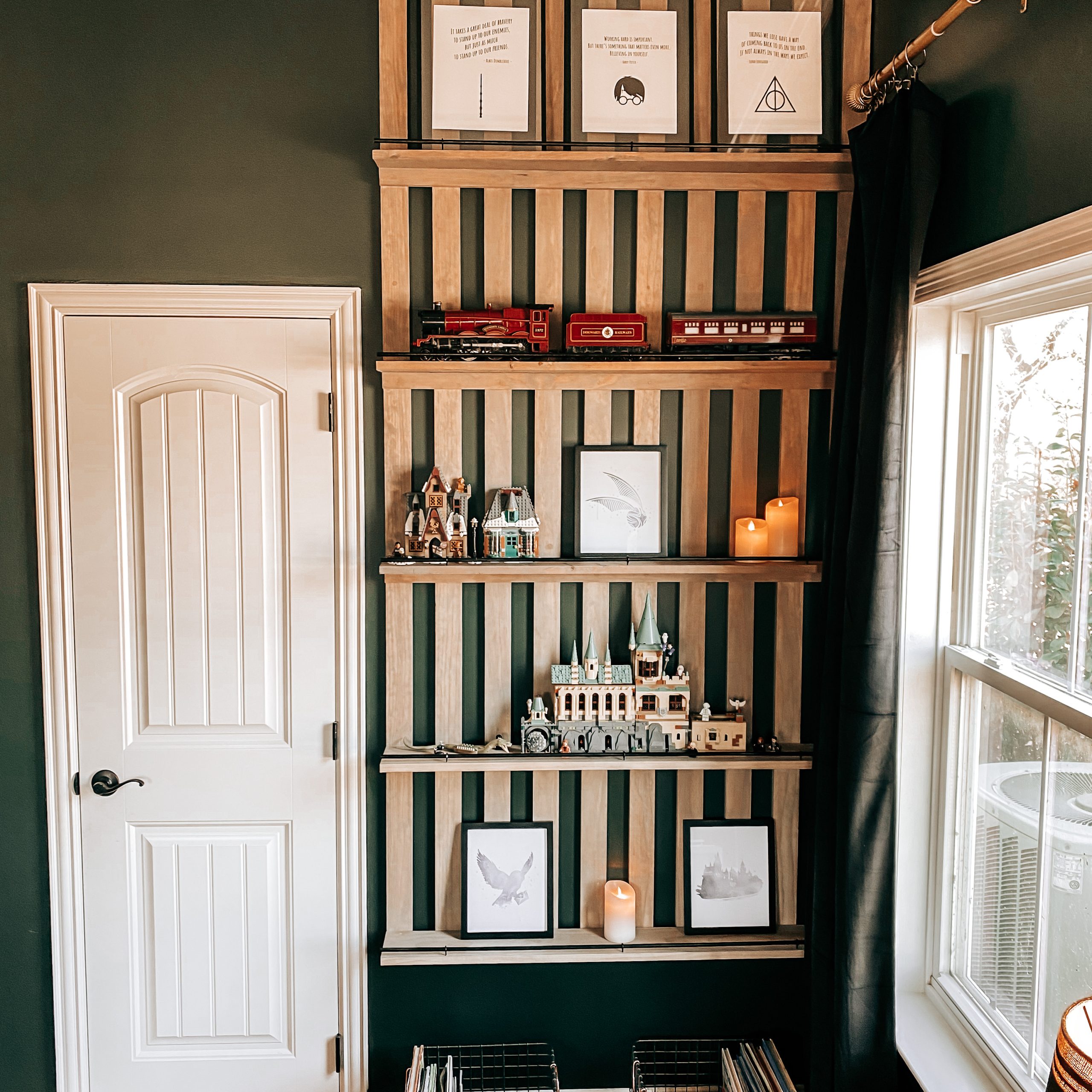
Next we added a wood slat accent wall with shelves. We wanted to create a cozy space for him to read and display all of his favorite Harry Potter treasures. You can read the full tutorial on how to build this DIY Wood Slat Accent Wall with shelves here.
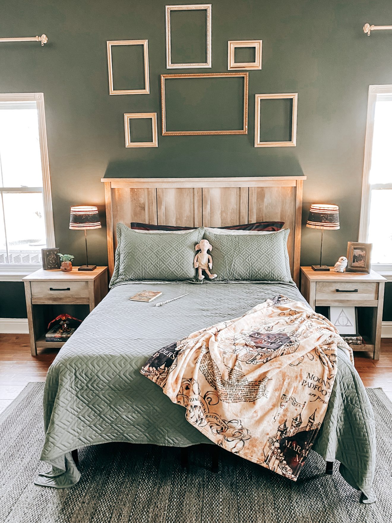
Choosing bedding was pretty simple because he already had a green comforter. We found some Harry Potter themed sheets, a Marauder’s Map throw blanket, a body pillow cover with the Hogwarts crest and this adorable Dobby plush toy.
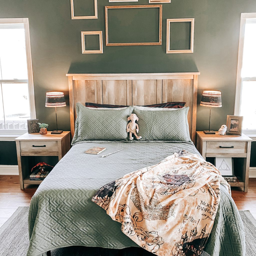

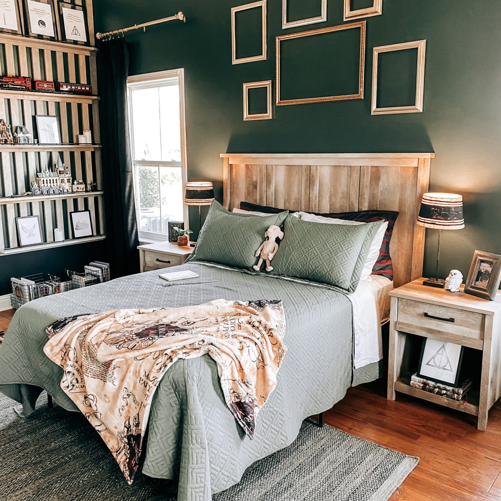
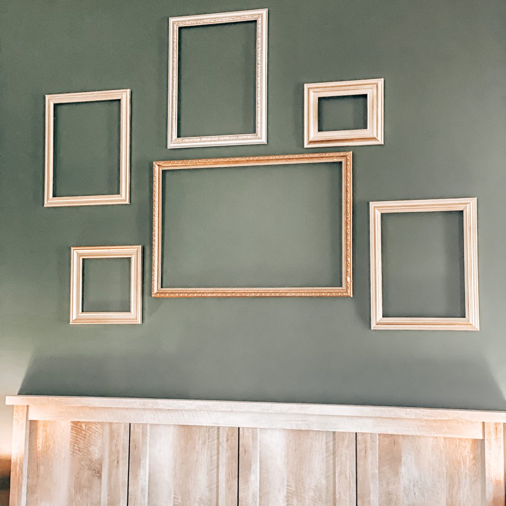
The next thing I added was the antique frame wall. The castle walls at Hogwarts are covered from floor to ceiling in elaborately framed portraits and I wanted to recreate this somehow. I headed to our local Goodwill store and found all of these frames for $2 a piece. I spray painted some of them gold so that they all had an antiqued look. They look so good against that green wall!
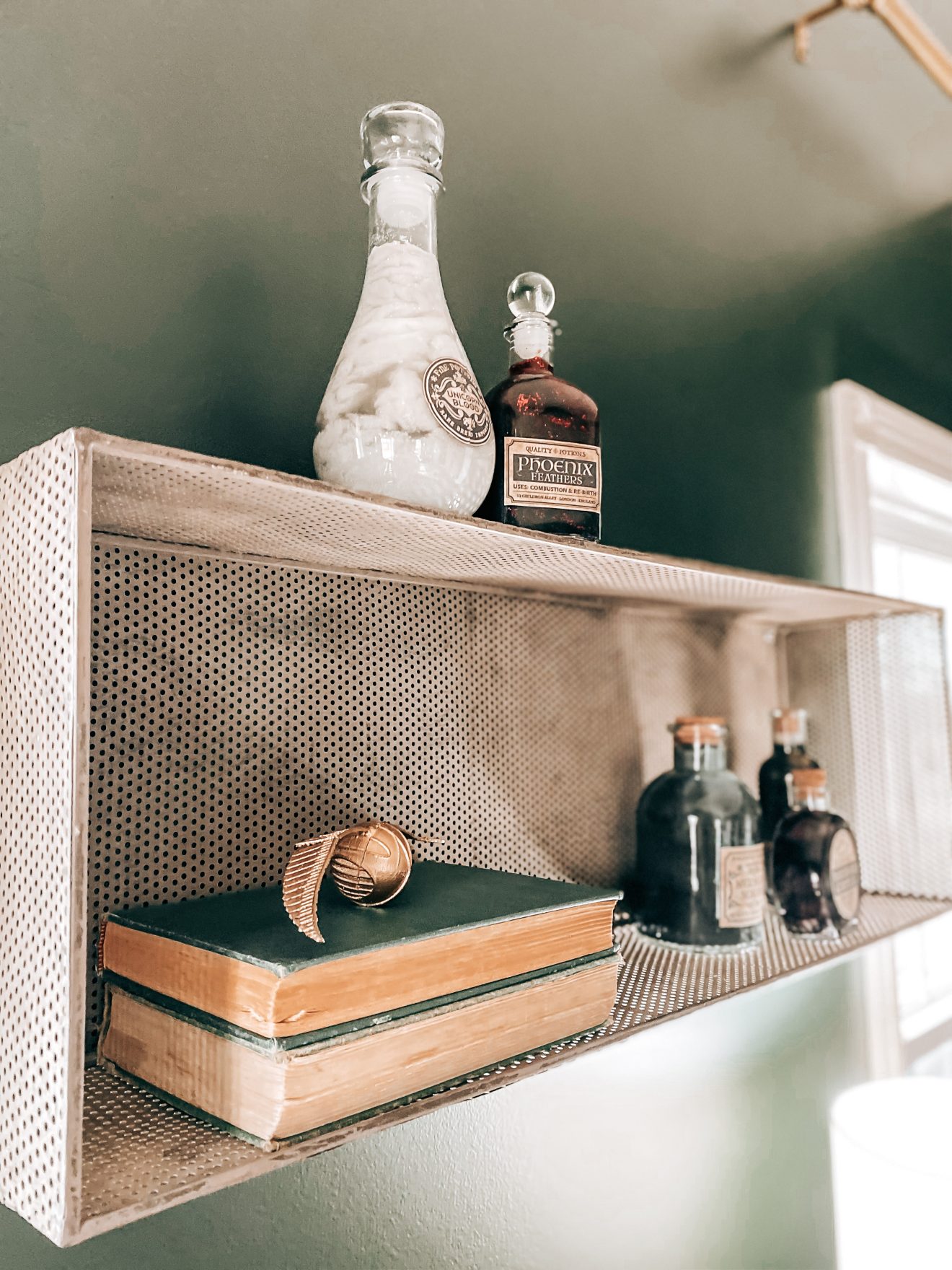
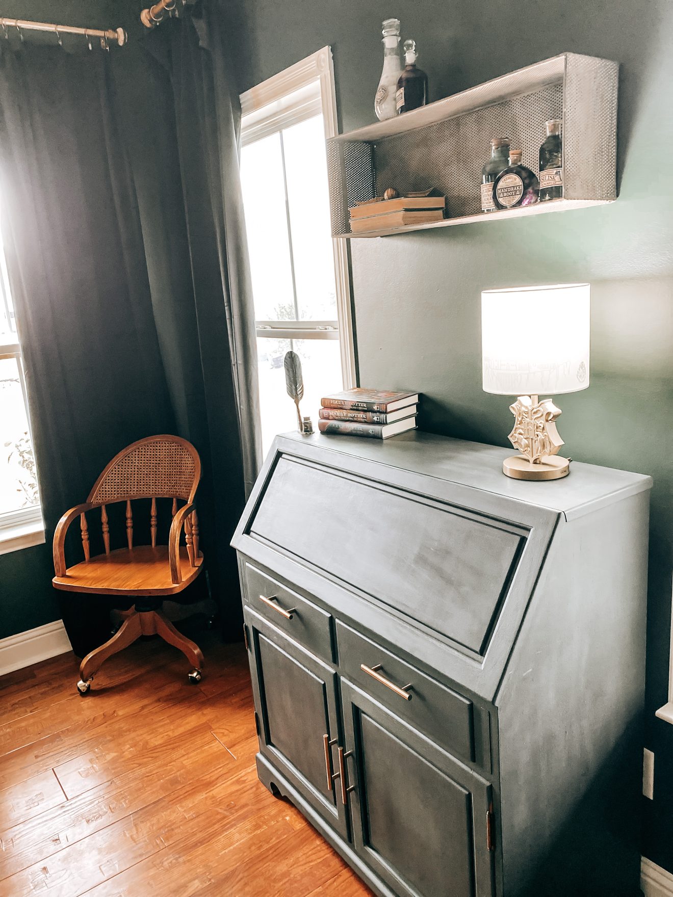
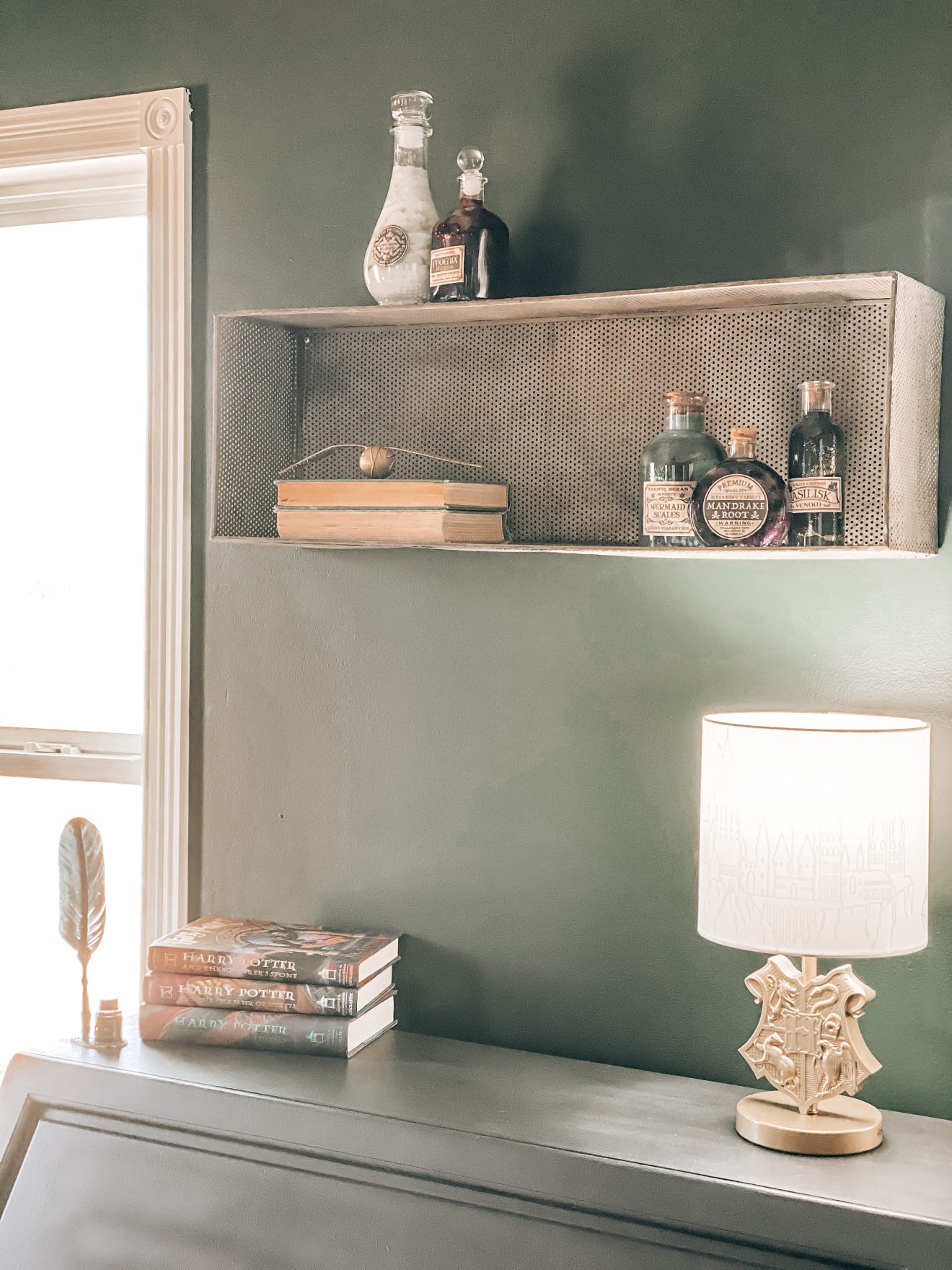
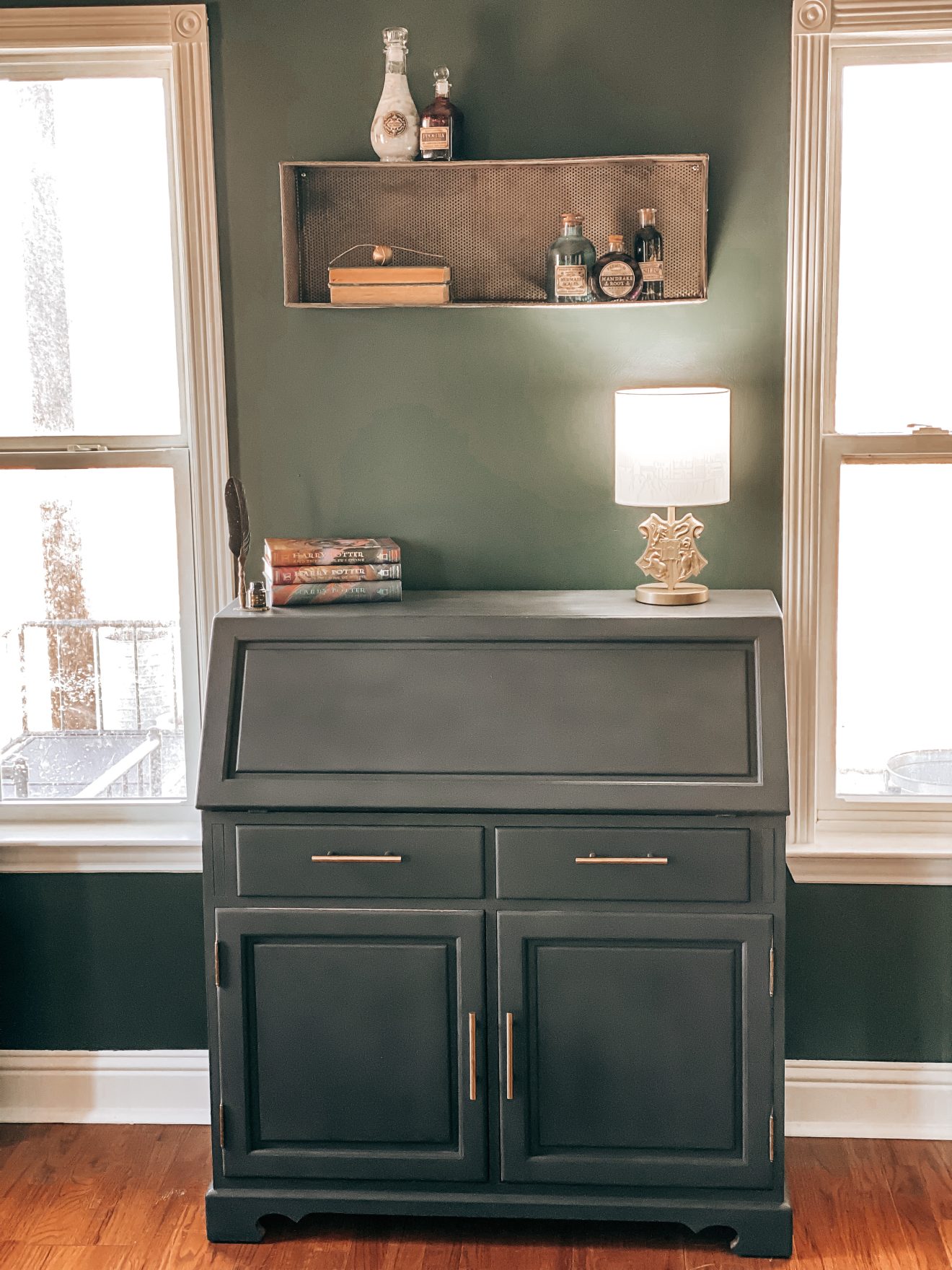
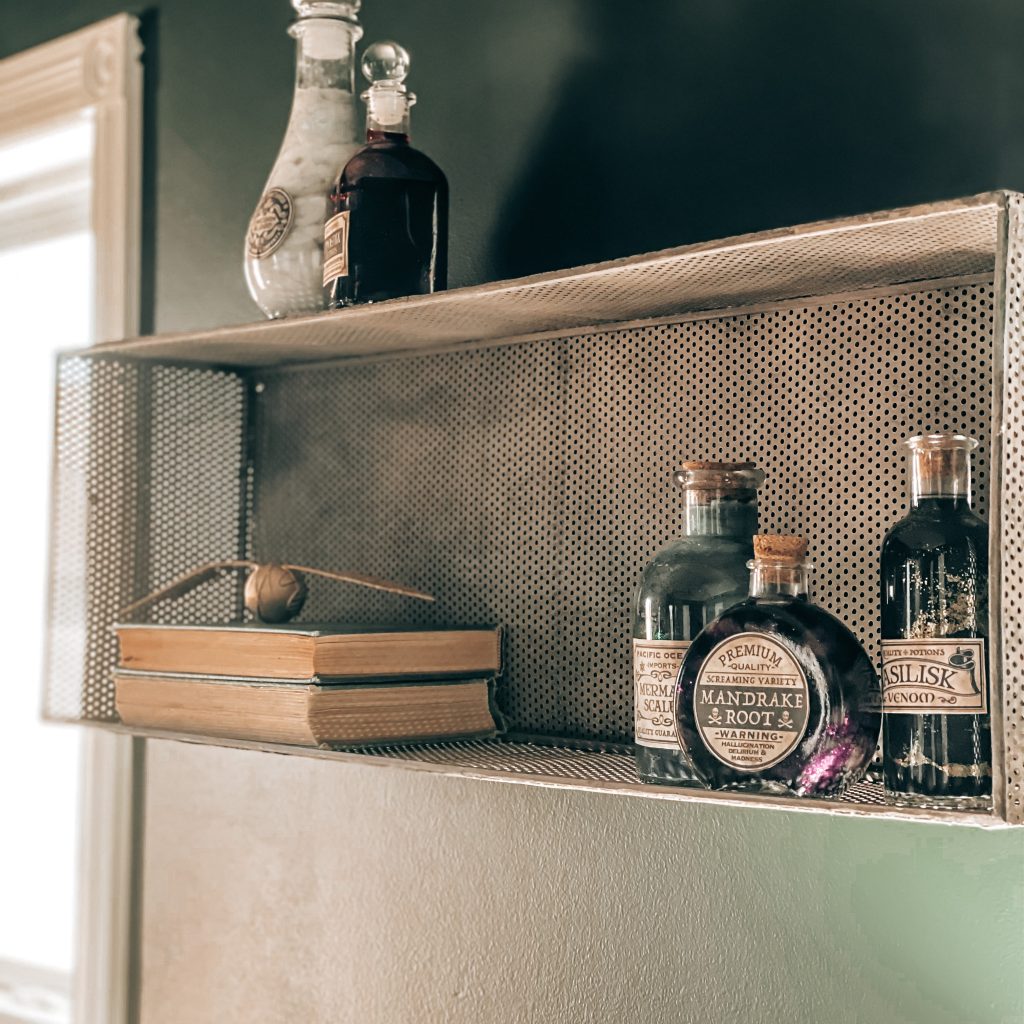
Potions class is a very important class at Hogwarts so we had to include some potions in our decor. I bought some corked glass bottles and printable labels to store our potions. Then I made my own potions using art supplies we had around the house. They turned out even better than I expected.
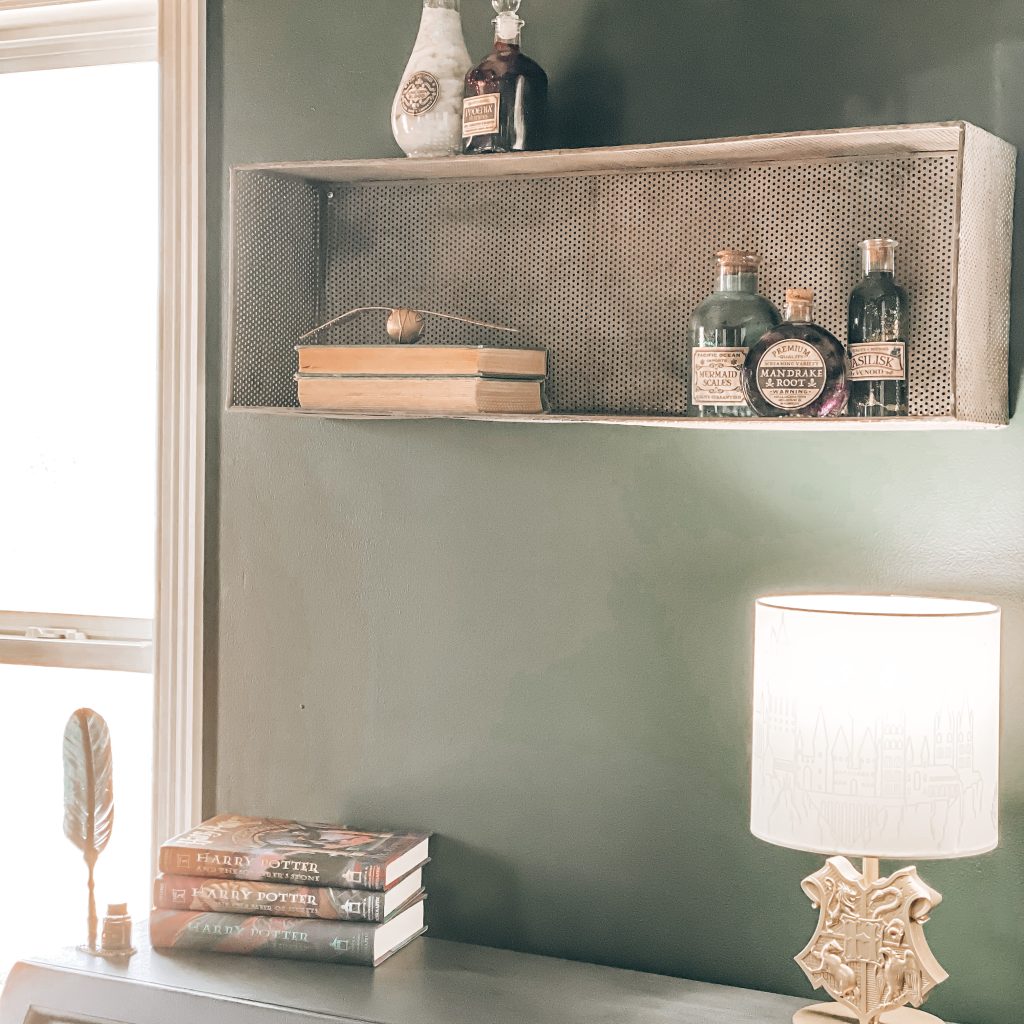
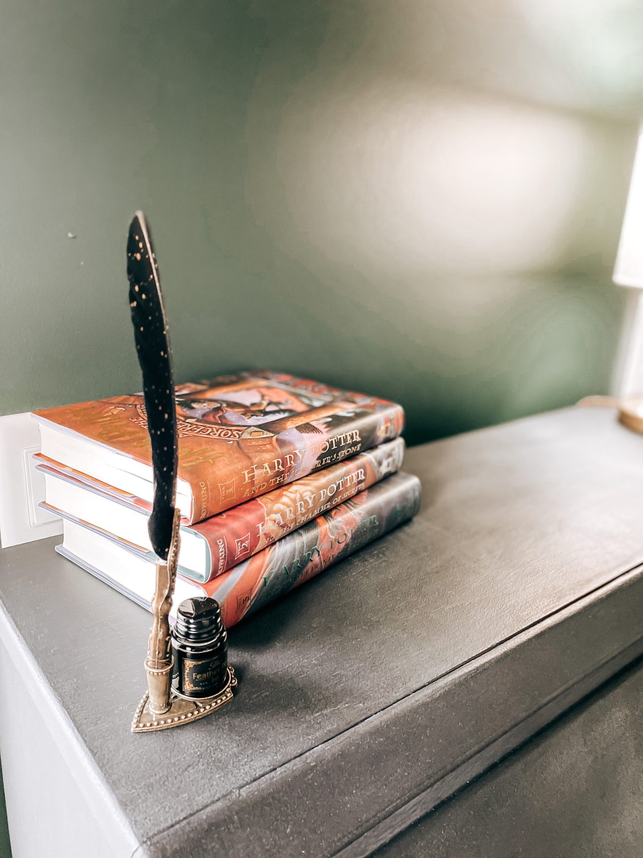
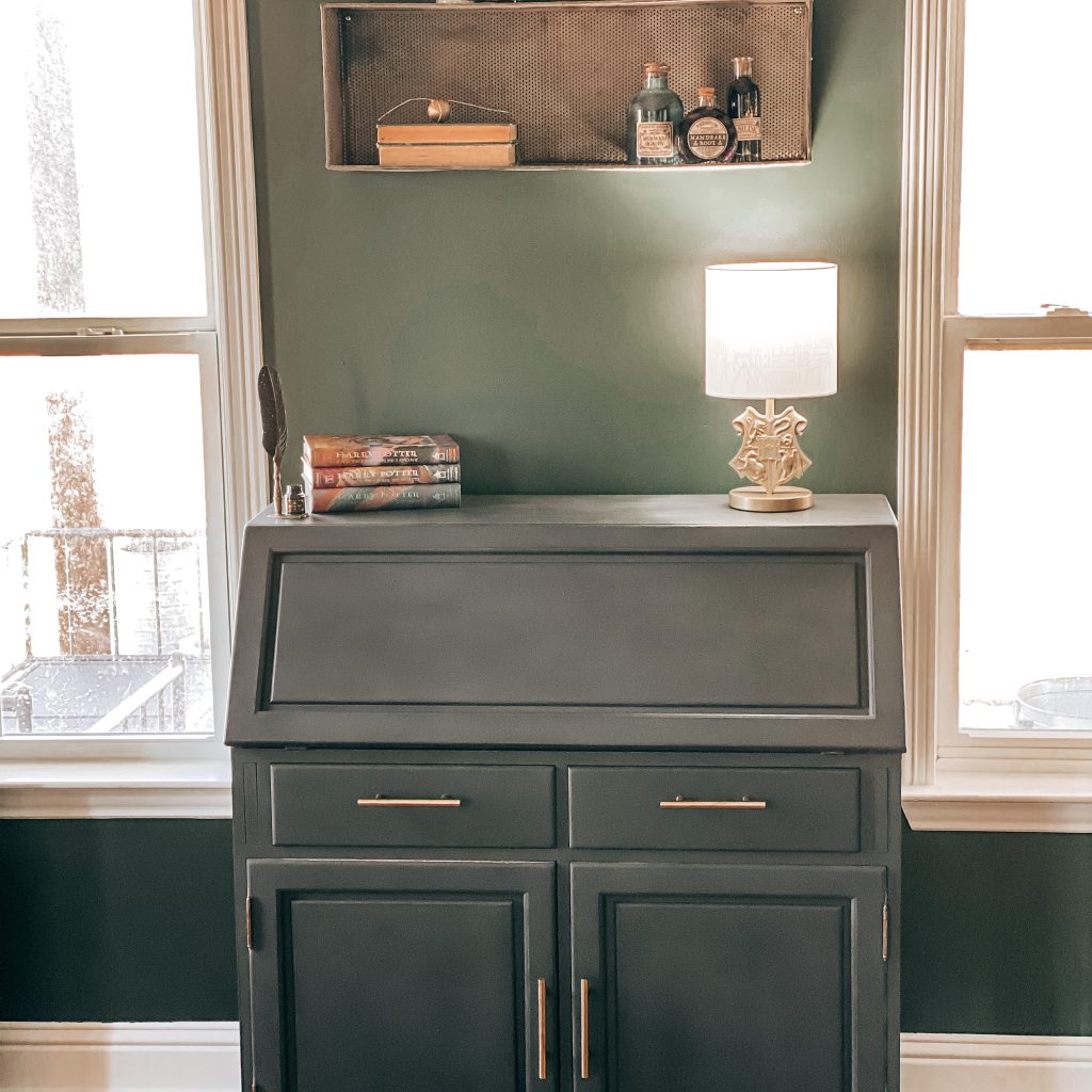
I painted his desk with a charcoal chalk paint and then added gold pulls to go along with the frames and the other gold accents in the room. I found the quill on Amazon and added it to the desk to make it look a little more turn of the century.
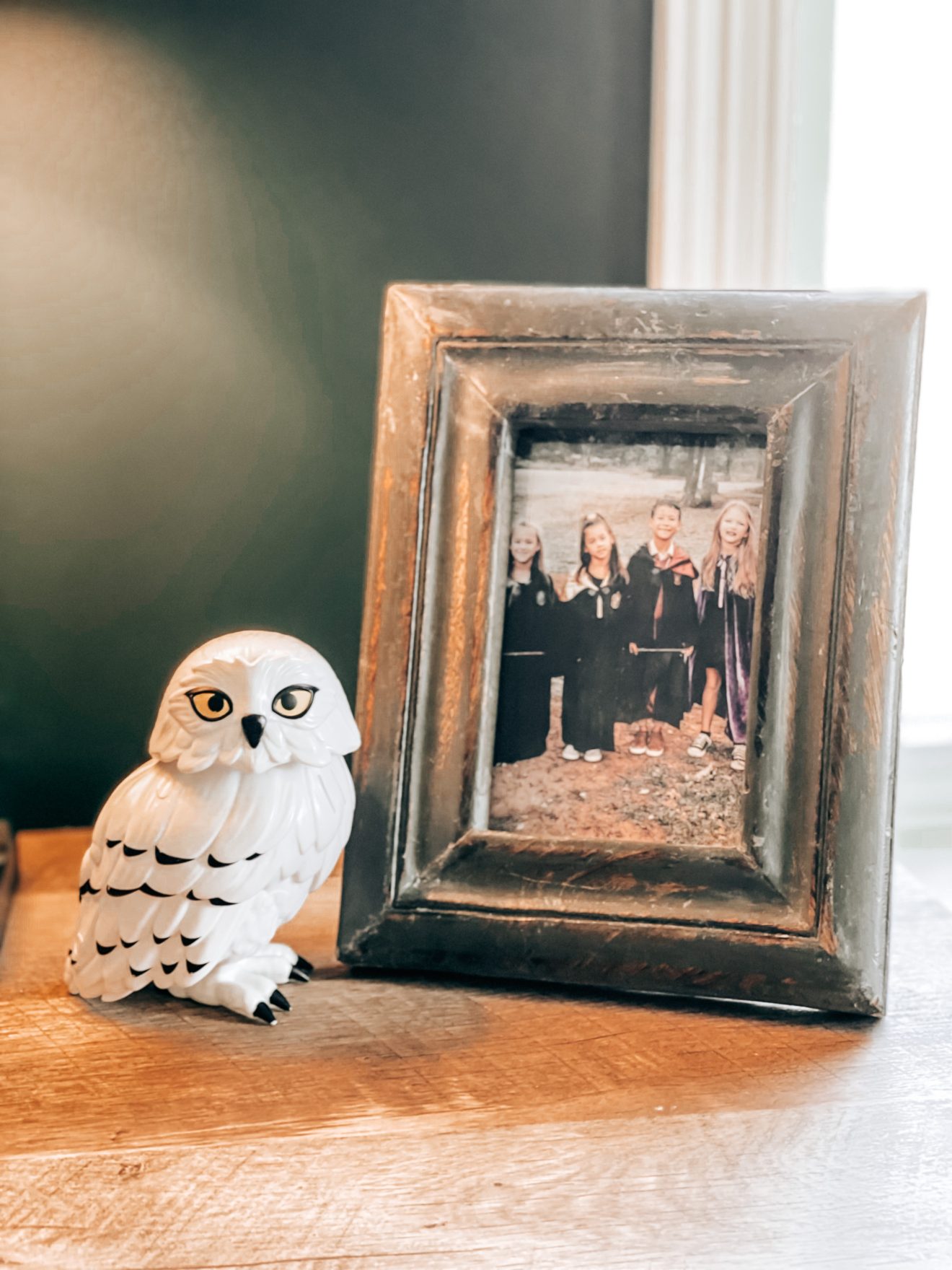
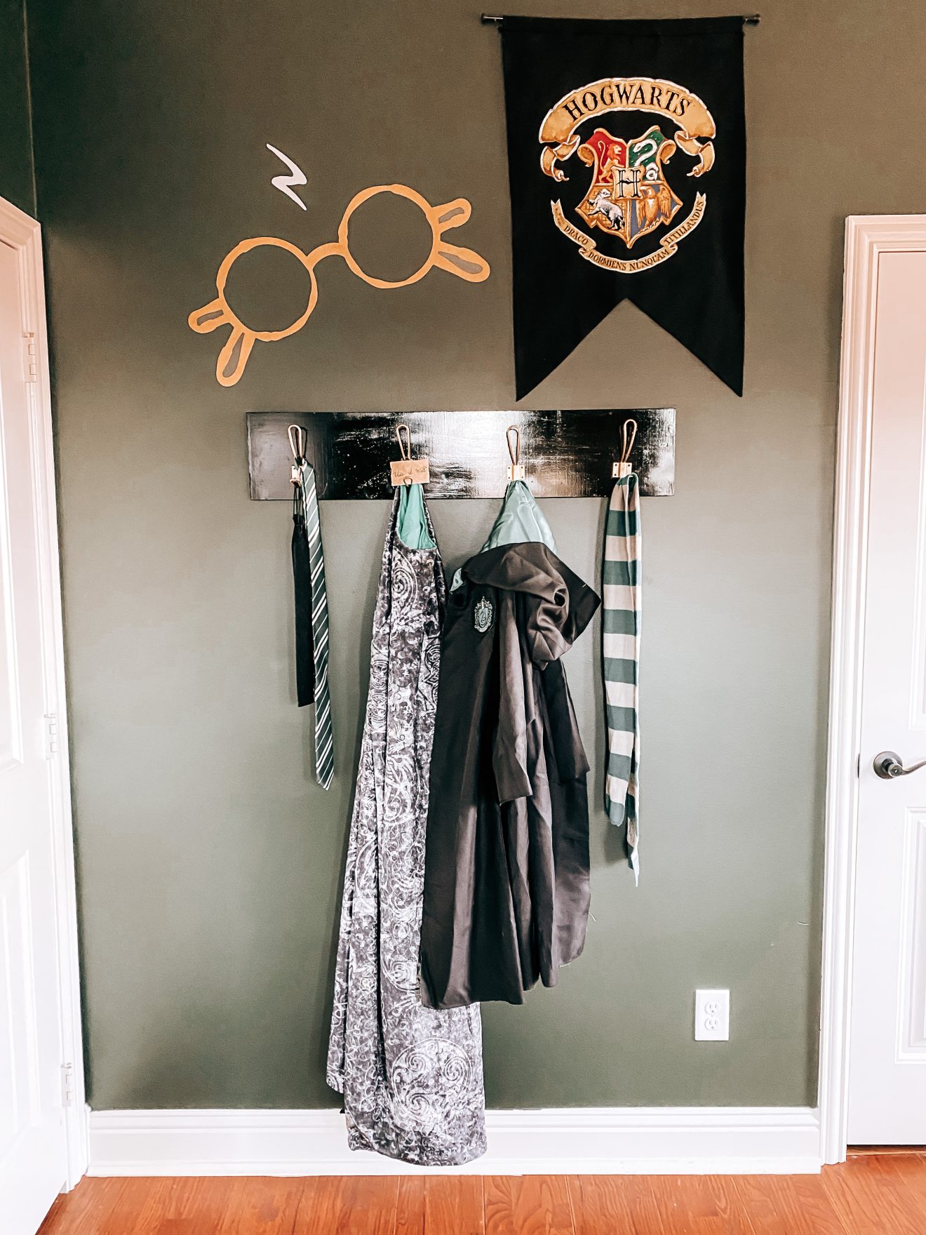
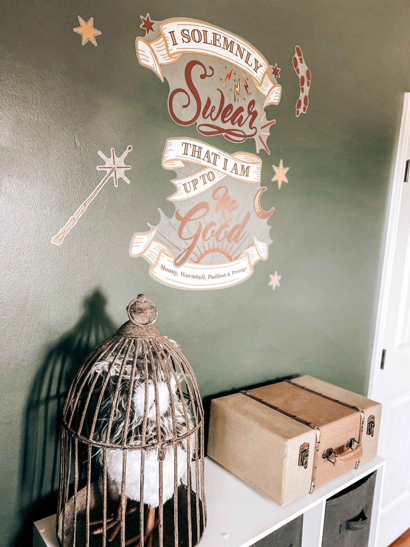
Hogwarts students arrive each year with their trunks and pets. In the Harry Potter series, Harry has an owl named Hedwig that becomes a loyal companion to Harry throughout his school years. So, obviously, Luke needed his own owl and trunk. Now he’ll be ready to go when he gets his letter 😉 I’m also completely obsessed with these Harry Potter wall decals! This corner just might be my favorite.
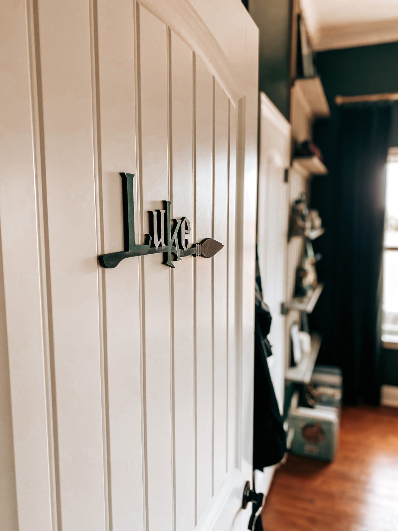
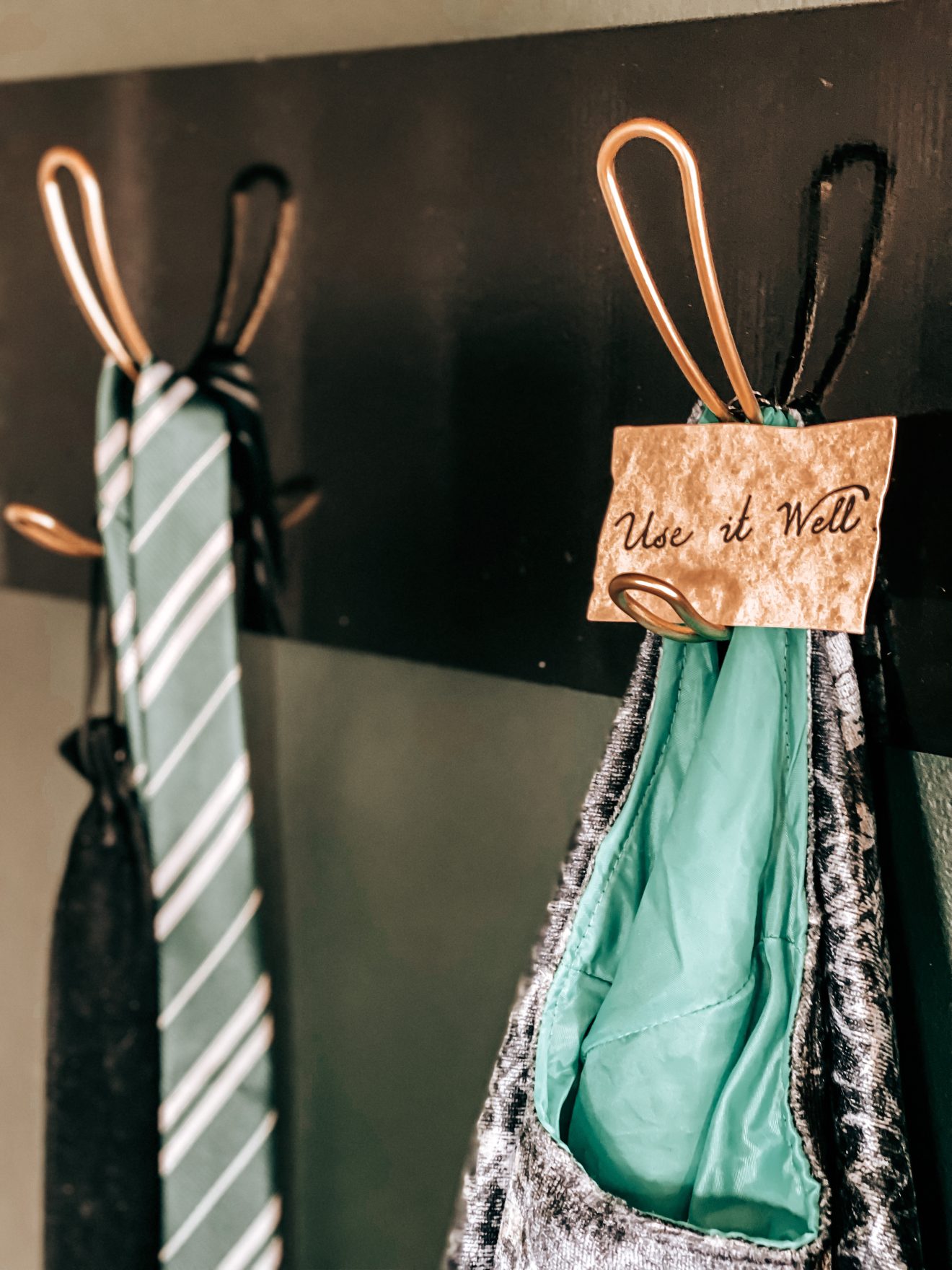
Finally, we needed a place to hang his Hogwarts robe, wand and invisibility cloak. We already had the hooks so we painted them to match the rest of the room. To finish out this wall, we added this Hogwarts banner and…another amazing wall decal.

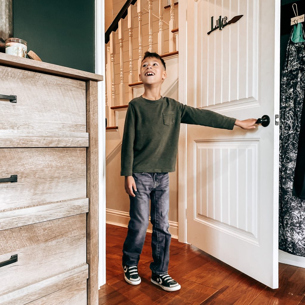
I had so much fun bringing this Harry Potter themed bedroom to life. The look on his face says it all. All of the hard work and details = WORTH IT!
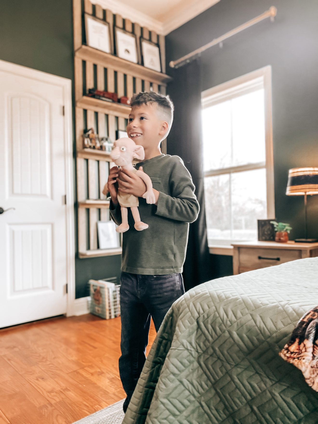
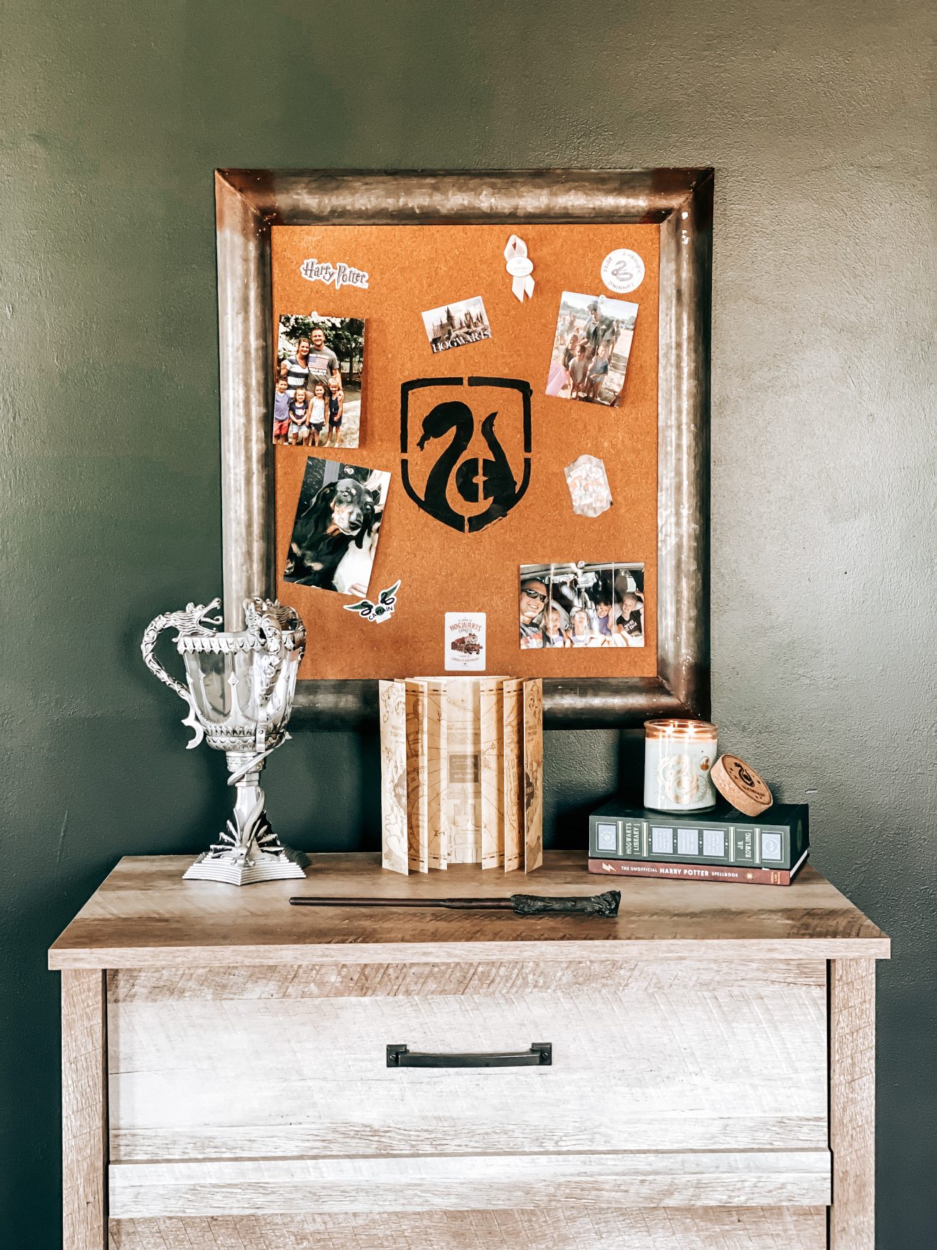
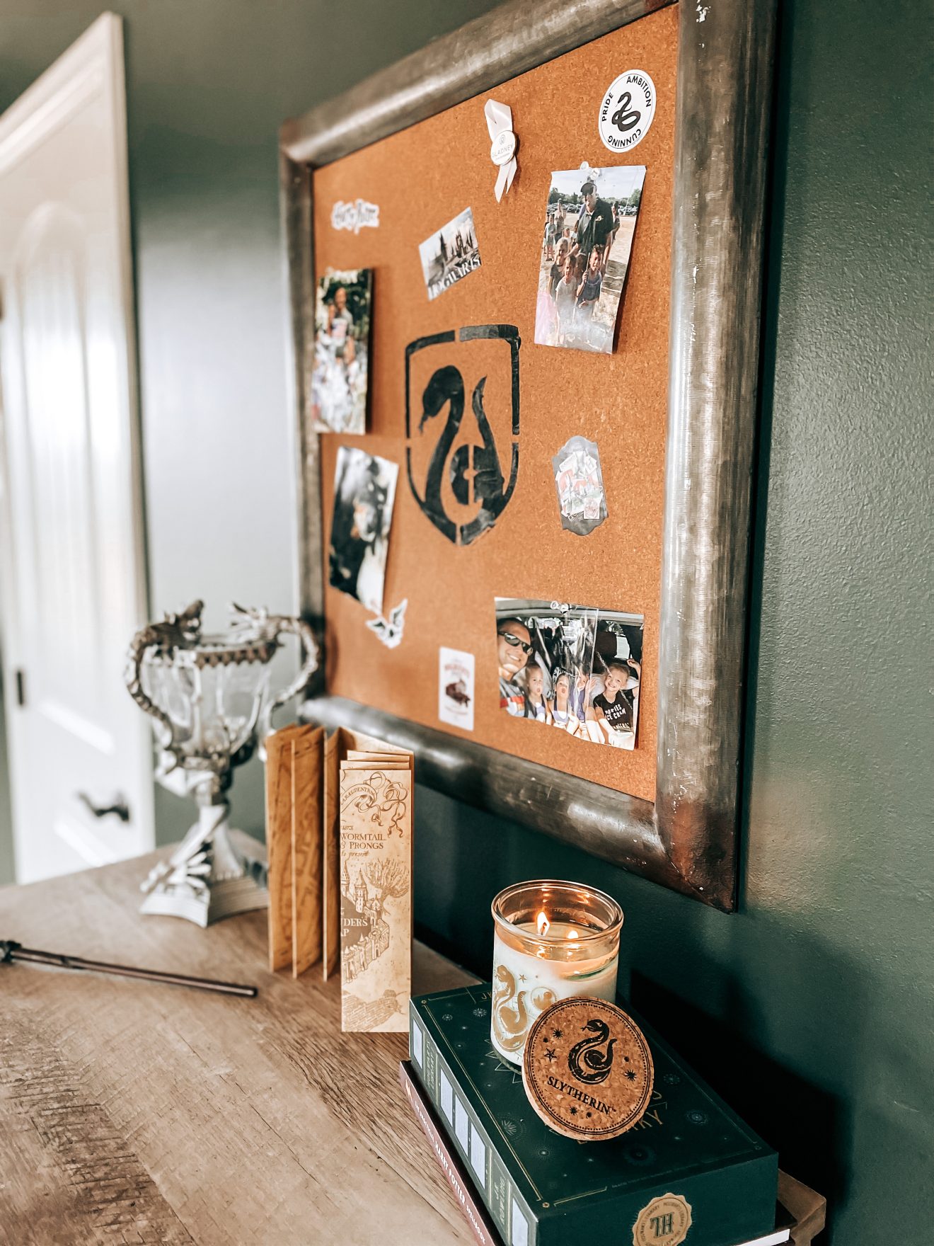
I hope this post inspired some ideas to help create a magical room for your Potterhead nerd…or for you…no judgment here 😜 Check out the slideshow below for some of the other Harry Potter details we added to the room.
Leave me a comment below and let me know what you think. Don’t forget to subscribe and follow us on Facebook, Instagram and Pinterest to keep up with our day to day. Thanks for stopping by!
Links for Items in Our Harry Potter Themed Bedroom
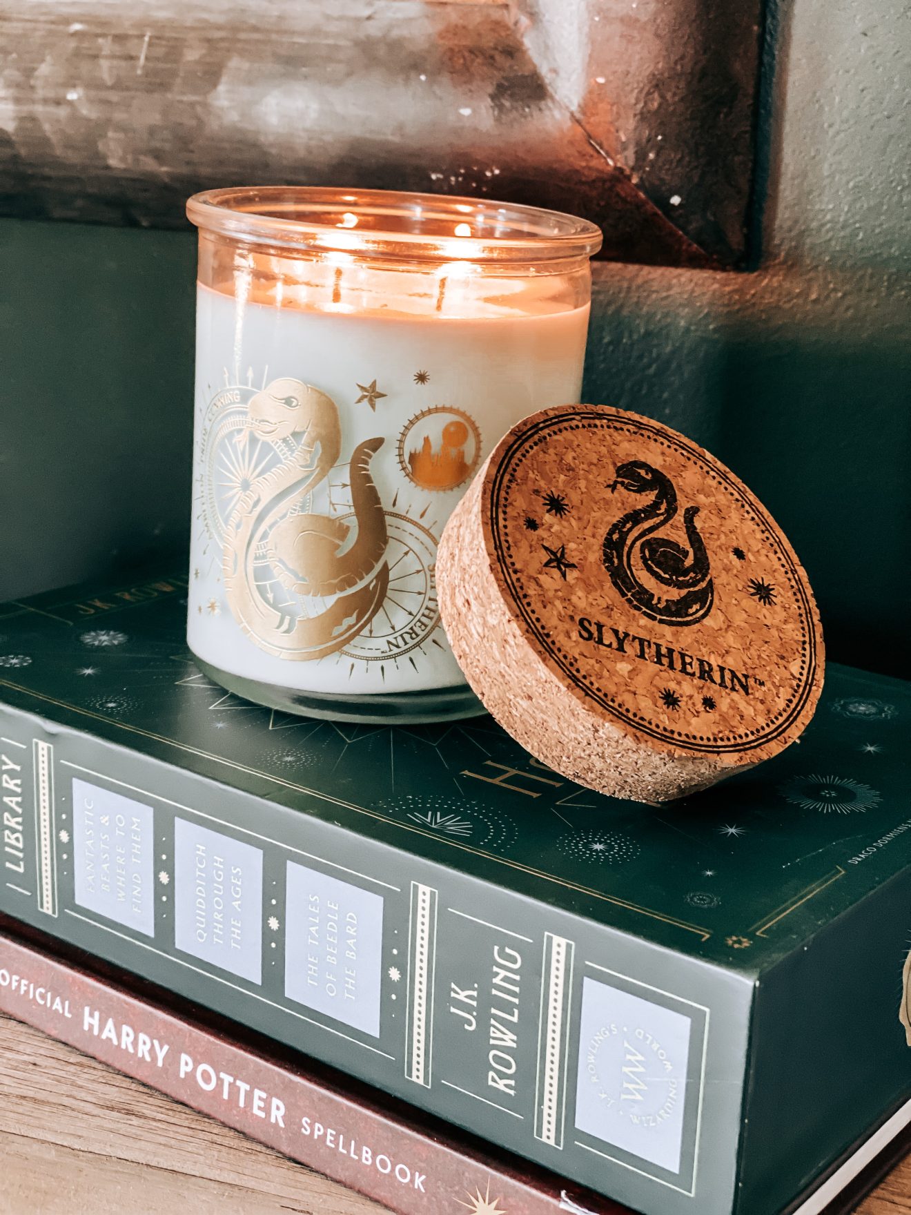
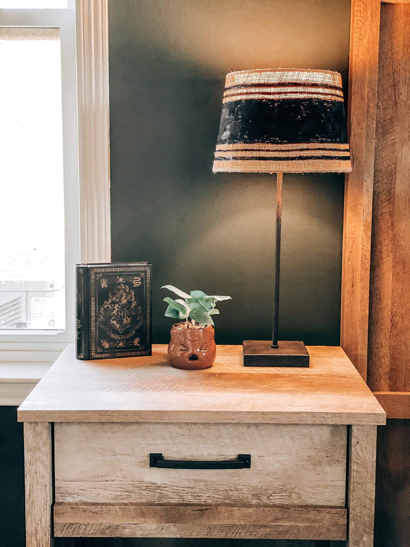
Hogwarts Body Pillow Cover | Charcoal Smoke Paint | Green Comforter | Marauder’s Map Throw Blanket | Hogwarts Sheets | Dobby Plush Toy | Metallic Gold Spray Paint | Black Velvet Curtains | Gold Curtain Hooks | Gold Curtain Rods | Potions Bottles | Potion Labels | Golden Snitch| Harry Potter Book Set | Illustrated Harry Potter Books | Hogwarts Library | Chalk Paint | Gold Drawer Pulls | Writing Quill | Hogwarts Desk Lamp | Hedwig Plush | Decorative Trunk | Wall Decals 1 | Wall Decals 2 | Coin Bank | Hogwarts Legos | Hogwarts Express | Wire Book Baskets | Floating Frames | LED Candles | Mandrake | Slytherin Candle | Slytherin Robe | Wand | Invisibility Cloak | Hogwarts Banner | Door Sign | Triwizard Cup | Bedroom Furniture Set | Charcoal Area Rug |
Our farmhouse kitchen remodel was probably the biggest and one of the most important renovations we made to The Yellow Rose Farmhouse.
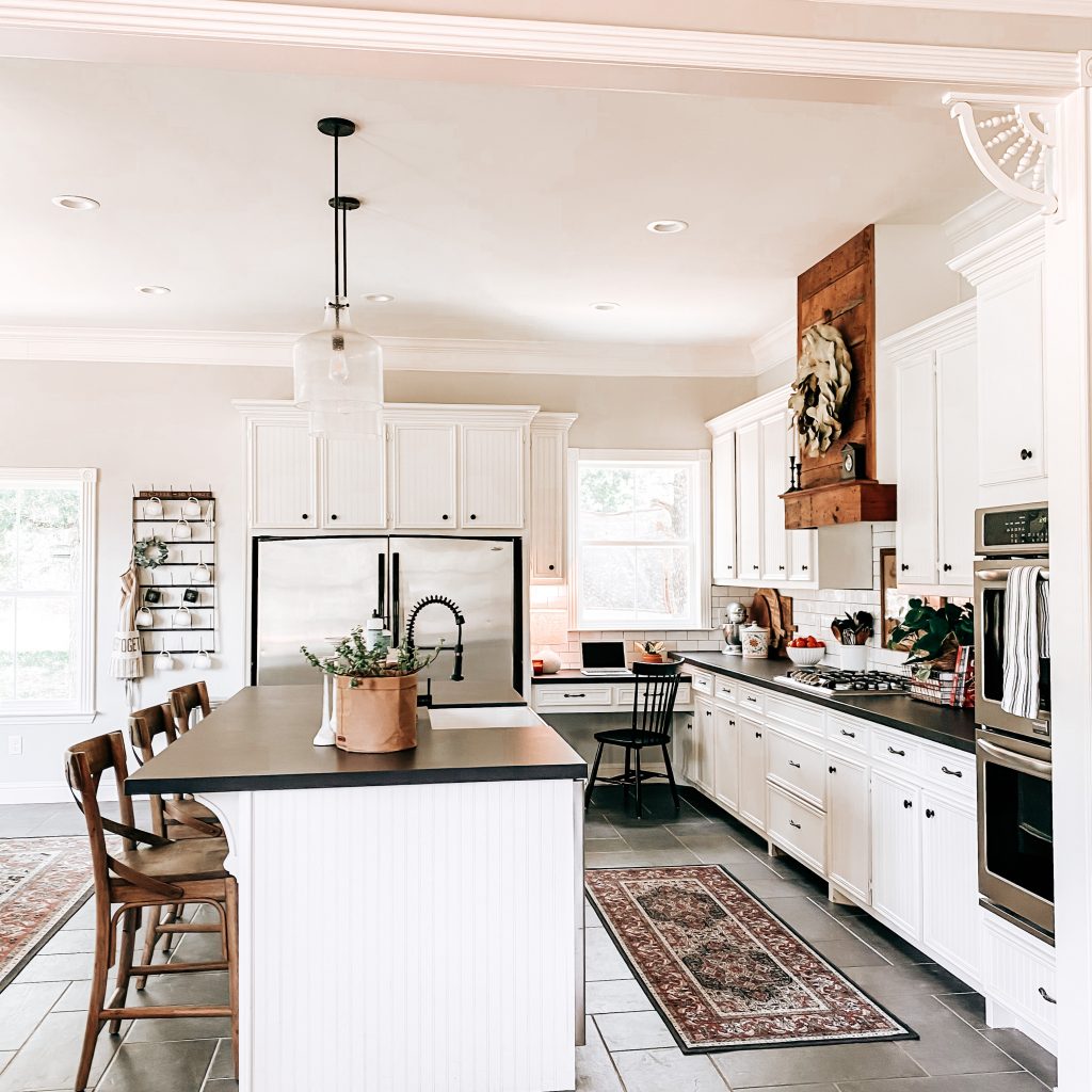
*This post contains affiliate links. That means that if you make a purchase after clicking on a link, I may earn a small commission at no extra cost to you.
Our kitchen is where life happens! It seems to be the place where everyone gathers to chat, snack and hang. We are so lucky to have a large family and friends group! That also means we need plenty of space for hosting get-togethers. One of the things we loved the most about this house when we were searching for our new home was the large kitchen. For as big as it was though, it felt a little crowded and blocked from the rest of the house. After some thought, we came up with a new floor plan that would open it up and accommodate all our kitchen needs and dreams.
The Demo & Rebuild
The original island and built-ins near the bay windows took up a bunch of space. The island wrapped around the kitchen in a sort of L shape. There were also really low hanging pendant lights all around. This made it feel too stuffy and closed in. I wanted something a little more simple and way more open.

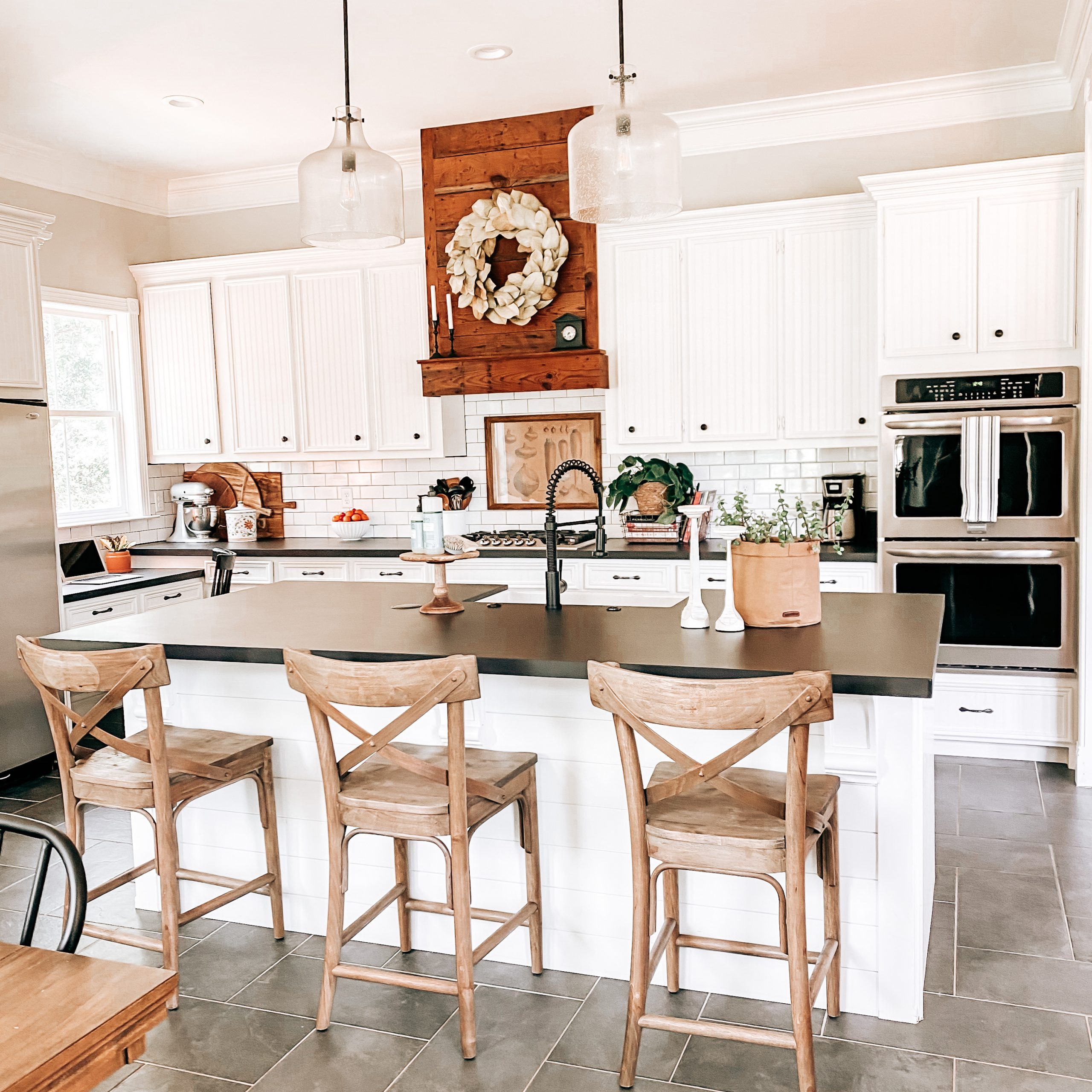
After some measuring and serious Pinterest inspiration, we came up with a way to still have a large island and the open concept farmhouse kitchen I dreamed of. Let the farmhouse kitchen remodel begin! Taking the island out meant adding a bunch of other projects to our list. Once we removed it, we also had to remove the original wood flooring because it wasn’t laid underneath.
We had to completely change the lighting since the layout didn’t work for us anymore. Then, of course, because I was changing the island and it’s placement, we had to be mindful of water and electricity. I knew I wanted a large island and I wanted to keep it simple. I decided to do a rectangular island with room for seating on one side and a farmhouse sink on the other. It needed to be large for extra seating but I didn’t want it to look bulky which is why I went with the simple shape.
The next thing I wanted to be sure to have was plenty of room to cook. First was the issue of the microwave. Yes, I love to cook but a microwave is a MUST because you never know when Mama just needs a break. We found a space on the side of the island that would be just perfect. It’s in a spot that’s hidden unless you’re looking for it but it’s in reach of the kids. Nailed it!
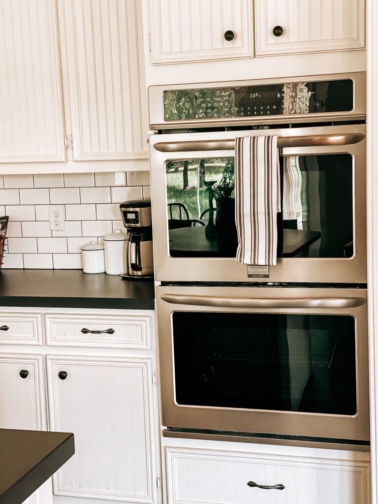
In our previous home, we had a large open-concept kitchen that I loved but the oven and stove top were fairly small. This kitchen had the same problem with the current range oven. I dreamed of hosting a Thanksgiving dinner with a double oven and plenty of room for goodies on a large cooktop. Isn’t that what everyone dreams about?! We took out the range oven and part of the cabinets and started making our cooking dreams come true!
The Layout & Design
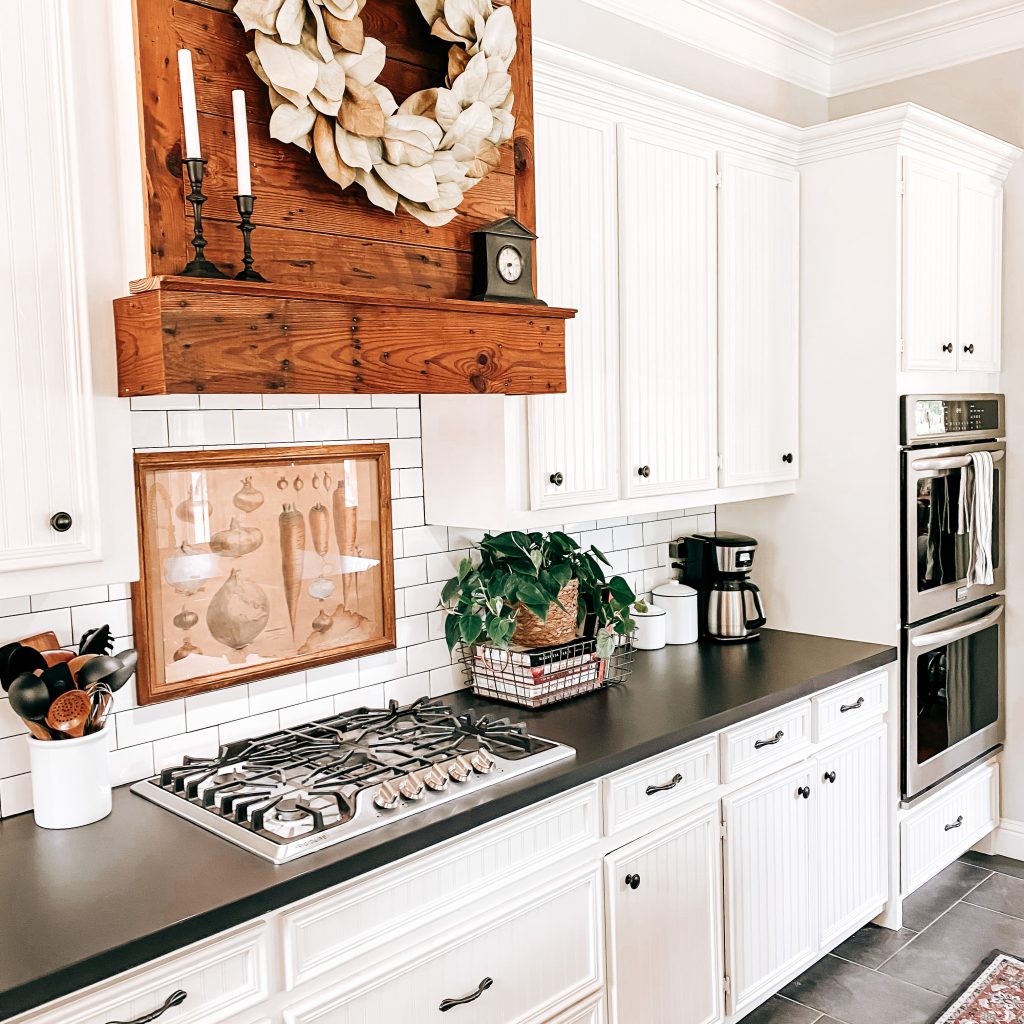
With all the major renovations out of the way, it was time to get started on the fun part. The design! The next step was a Pinterest binge (obvi…🙄🤪). I tried to take careful notice of any trends, patterns or similarities in my pins. I learned that I was drawn to simple, neutral, bold color contrasts and wood accents. The first decision I made was the color of the cabinets. I went with Sherwin Williams’ Alabaster. It’s the perfect white and really adds to the bright and airy feel of the kitchen.
I knew right away that I wanted subway tiles. I didn’t want anything patterned because I was scared I’d want to change my kitchen style in ten years and they’d throw off my vibe. Commitment is hard but subway tiles are neutral and timeless. I love the simplicity and industrial look of subway tiles. They were an easy choice and may just help prevent a style identity crisis later on.
Flooring, countertops and lighting, oh my! I really struggled deciding on these. There are just so many to choose from and it can be hard to visualize what they’ll all look like together. To get started, I took samples of my backsplash and paint and looking at countertops samples at HomeDepot. I knew that we had a really large space and that I’d need them to be affordable and durable. I ended up going with Domoos by Dekton. These countertops are amazing and I loved the contrast of the black countertops with our white subway tile and cabinets. There are a million different styles you can choose from but I really liked the minimalist look of the solid black. Ultimately I chose this material because it doesn’t scratch or stain, it’s heat resistant and super easy to clean. I was sold!


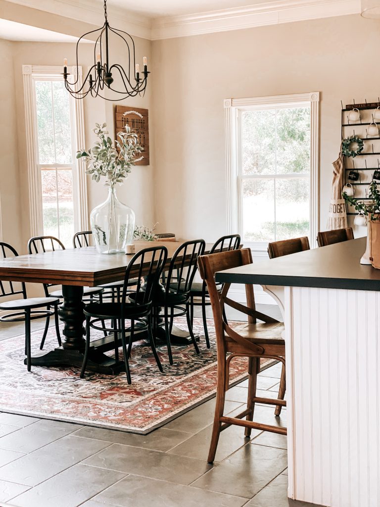
Once I had our countertops, it became a little easier to find flooring. I wanted darker floors because I knew this was going to be a high traffic area. I really loved the herringbone layout with the thin tiles but unfortunately most were out of our budget. So I found some larger rectangular tiles and I was able to lay them herringbone. The layout is not as obvious as it would have been if we’d had the smaller tiles but I think it still looks unique. My only regret on the floors is the grout. We used a light grout and it is so hard to keep clean. If I were to do it all over again, I would use the same colored grout that we used in our laundry room renovation.
Last but not least, the lighting. I love shopping for lighting but it can definitely be overwhelming. Especially when you are as indecisive and as picky as me 😬 I’d had my eye on the chandelier I chose for the dining room for years. It was a no-brainer for me that it would hang beautifully above our table. It is still one of the fixtures I get asked about the most.
The pendant lights above the bar were a bit more difficult to decide on. I had originally purchased black barn lights and thought they’d be the perfect fit for my dream kitchen. However, after they were installed, I felt like they blocked my view of the range hood (one of my favorite parts). I needed to find something a little more dainty. I searched all my usual favorite spots and I ended up finding these beauties at a local lighting store. They were exactly what this kitchen was missing.
Farmhouse Kitchen Decor
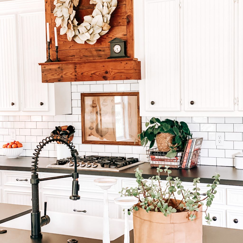
If you’ve followed me for long, you know this is always my favorite part. As I said earlier, I love a simple look, bold contrasts and wood accents. The barnwood range hood is definitely one of my favorite spots in the kitchen and it really stands out from all the white around it. I wanted to add a little greenery and a magnolia wreath just felt right.
I also added some natural wood barstools and some cute wooden cutting boards. There isn’t a lot of wall decor because, again, I really wanted to keep it simple. On the walls next to the table, I have some round shelves styled with plants and old books. I love these shelves so much and you can actually find these same ones in one of the girls’ bedrooms too.They’re just so versatile and a statement piece for sure. The cup rack on the wall next to the refrigerator is also a piece that I knew I had to have to complete the look of my kitchen.


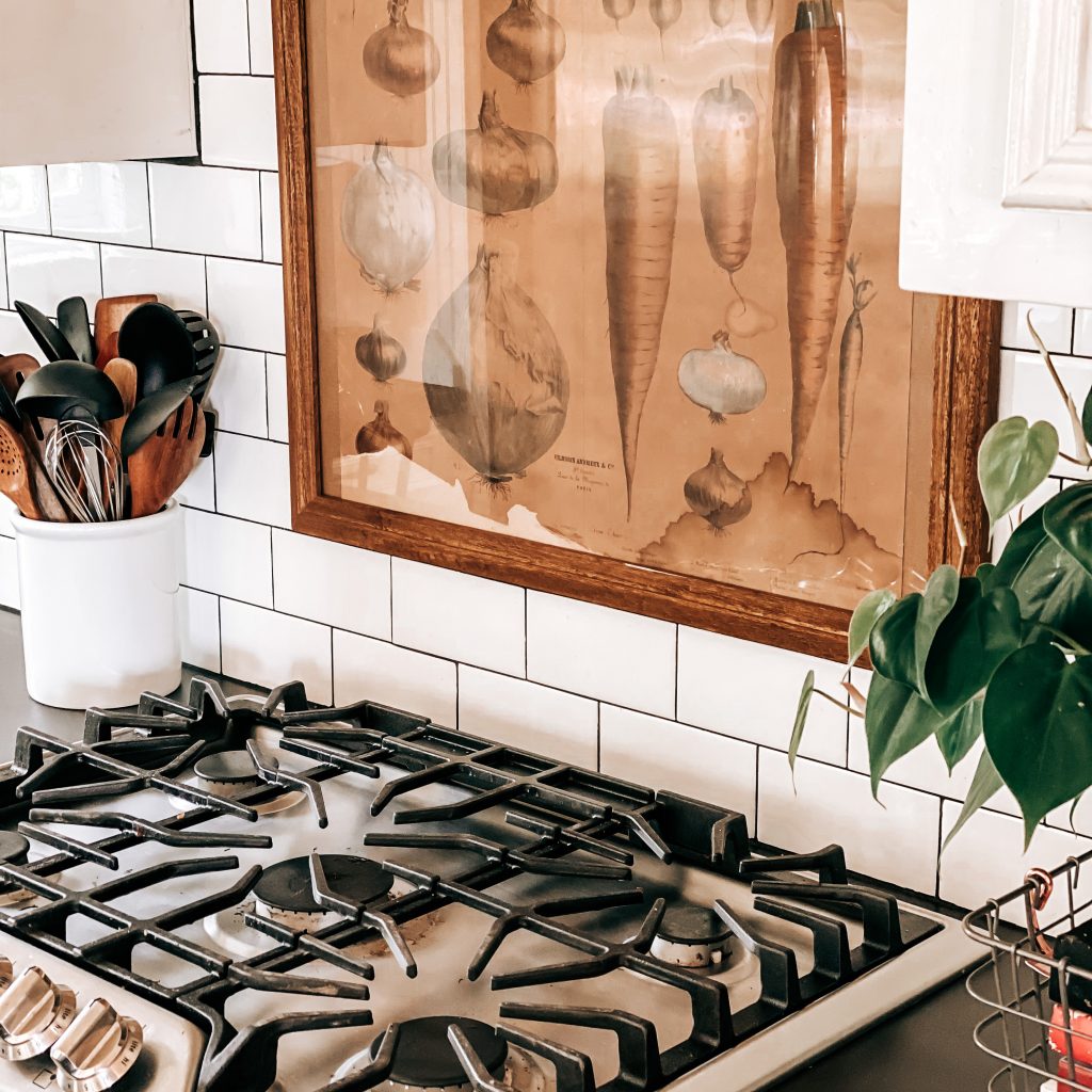
I’ve changed up the decor behind the range a few times but currently I am loving the vintage vegetable print I found at the Round Top Antiques Fair last season. To complete the look of my kitchen, I added a boho patterned area rug and runner. Did I mention that they are WASHABLE?!?! Genius move for moms of kids and dogs, just saying. And they’re super cute! I change out most of the other decorations by season or depending on my mood 😏
I think every remodel is a learning experience but it’s so rewarding once it’s all finished. Our farmhouse kitchen remodel was a success and a huge help in making The Yellow Rose Farmhouse feel like our home. Be sure to check out some of our other remodel projects here.
I hope you enjoyed our farmhouse kitchen remodel. I’d love to hear all about your kitchen remodeling wins! What inspires you? What’s keeping you from having the kitchen of your dreams? Leave me a comment below. Don’t forget to subscribe and follow us on Facebook, Instagram and Pinterest to keep up with our day to day. Thanks for stopping by!
Sources For Our Farmhouse Kitchen Remodel
*Click the items below to shop affiliate links
Area Rug | Runner | Countertops | Subway Tile | Floor Tile | Mixer | Cooktop Range | Double Oven | Decorative Metal Basket | Faucet | Farmhouse Sink | Counter Stools | Farmhouse Table | Dining Chairs | Mug Rack | Round Metal Shelves | Pendant Lights | Chandelier | Light Bulbs for Chandelier | Seagrass Planter | Magnolia Wreath | White Candle Holders | Black Candlesticks | Large Glass Jug | Lamb’s Ear | Pothos Plant | Faux Olive Tree | Table Lamp |
